Enable people to book their campground sites in Campendium
I created a comprehensive campground booking platform from scratch and integrated it into the existing website
Campendium is the leading campground listing and reviews website and mobile app.
When I joined Roadpass, I was assigned to create a seamless campground booking system on Campendium, eliminating the need to redirect users to third-party websites.
This required building a complete booking process and seamlessly integrating it into the existing Campendium site.
Role: Product Designer
Skills Used: User research, competitive analysis, wireframing, low and high fidelity mockups, interaction design, prototyping
Tools used: Figma, Usertesting.com
Timeframe: ~2 months, 2022
Campendium lacked a direct booking feature, depending on third-party platforms. This offers an exciting chance to introduce a new revenue strategy through an integrated booking platform.
The challenge is to offer users a seamless experience for finding campsites, entering their details, and making bookings directly on Campendium.
I worked extremely closely with my product manager to break this huge proect down into manageable chunks for both me and the developers. We decided on the order of operations as well as some clean breaking points where we could divide the work up into multiple sprints.
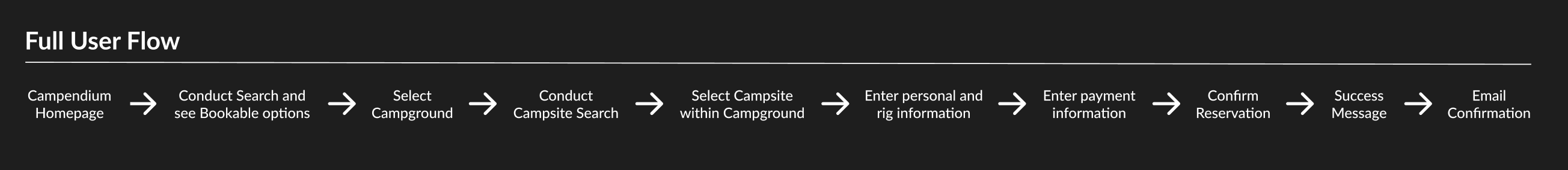
Step 1: Campground Search
Step 2: Campsite Search
Step 3: Checkout
Step 4: Confirmation
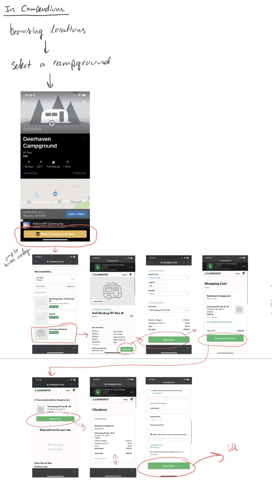
I started by diving in to see how users currently would have to book a campground through our third-party integration. The process was very confusing and cumbersome.
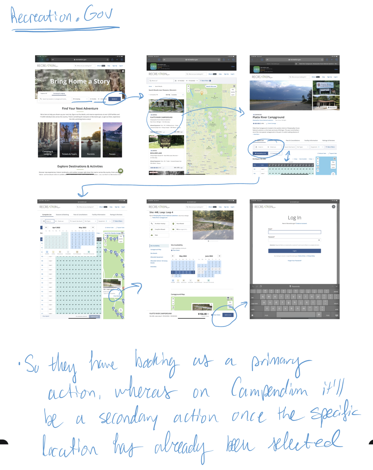
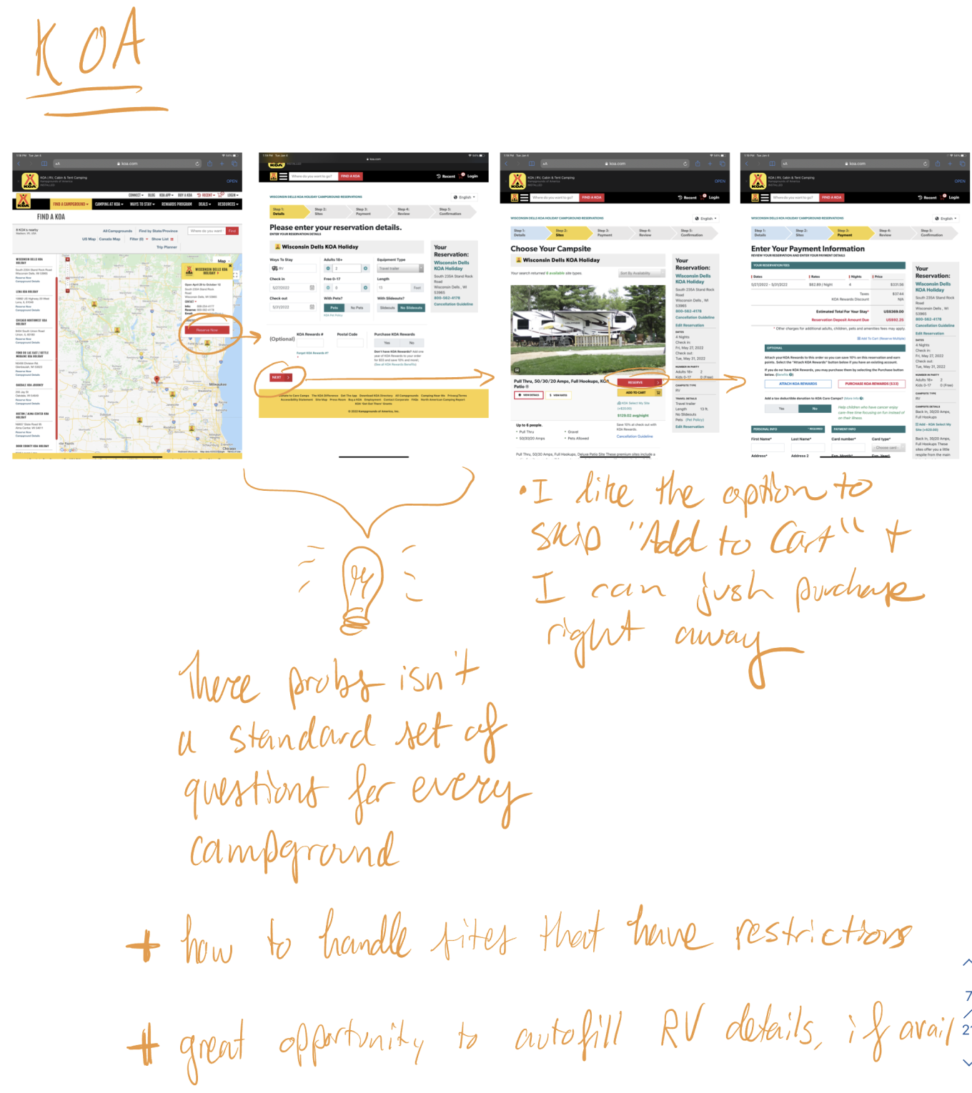
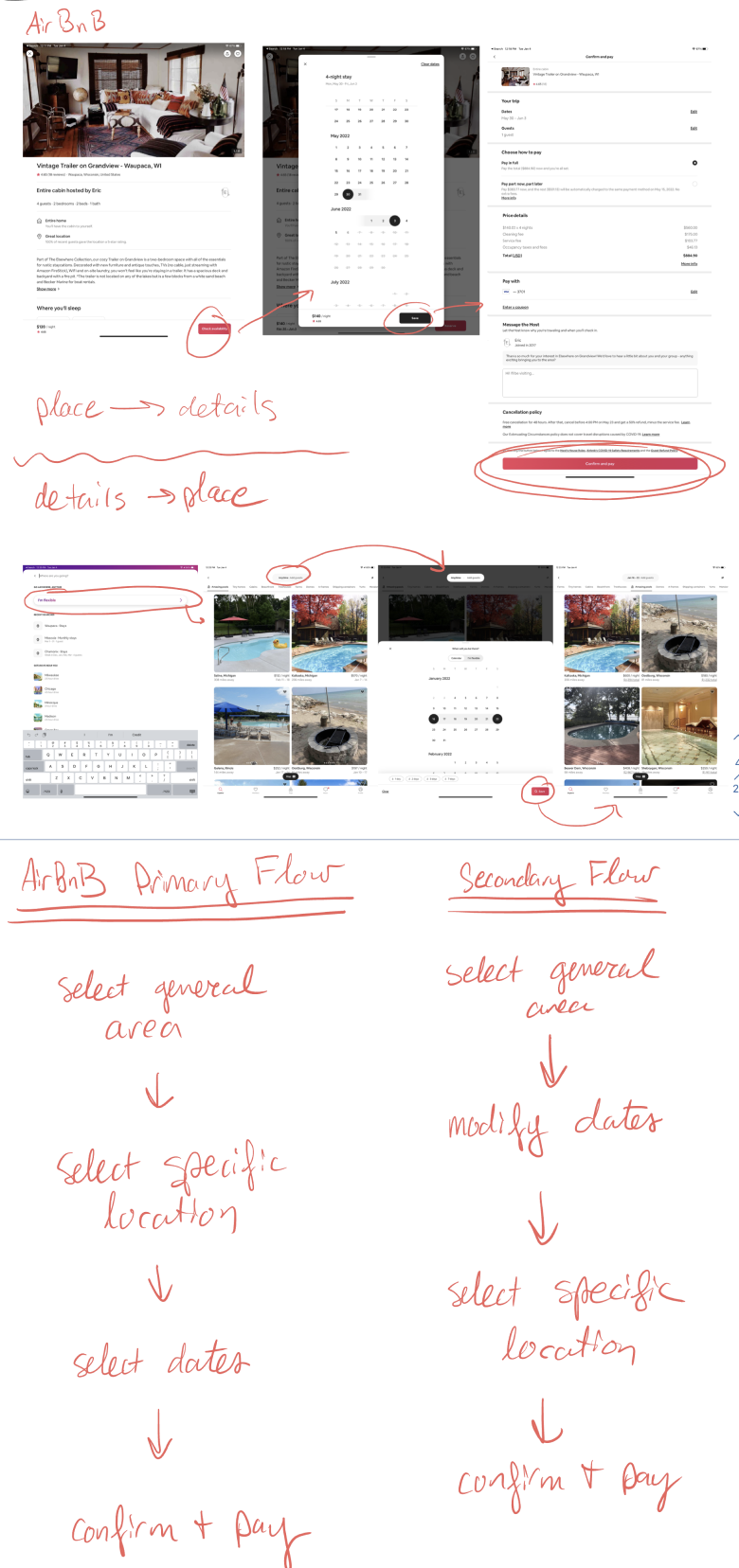
I looked at various booking websites to gather information for competitive analysis. My biggest takeaway was that there's not one set path that users expect to go through across different sites, meaning we don't have to adhere to a strict formula for the flow.
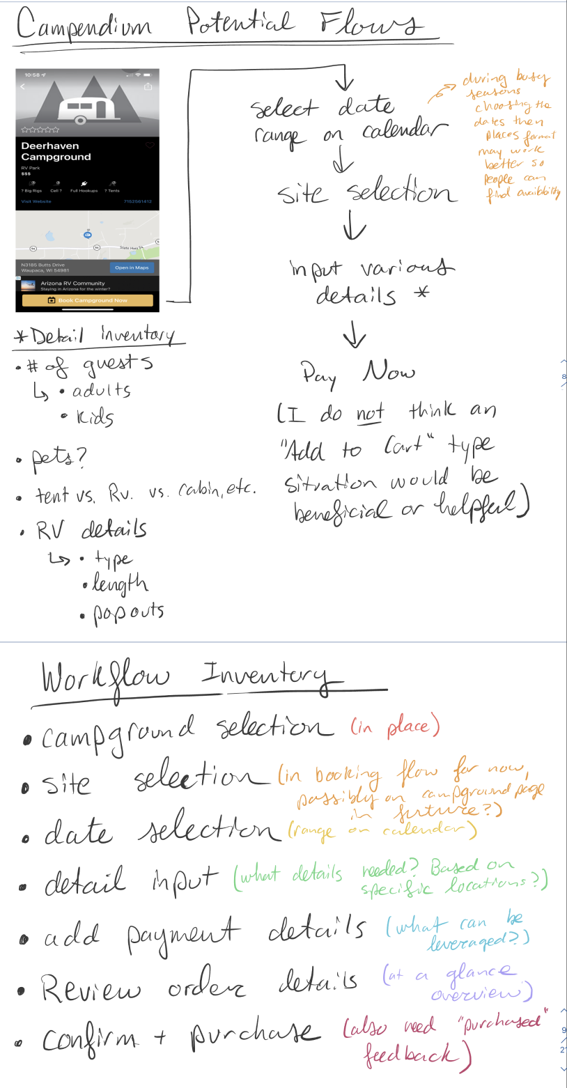
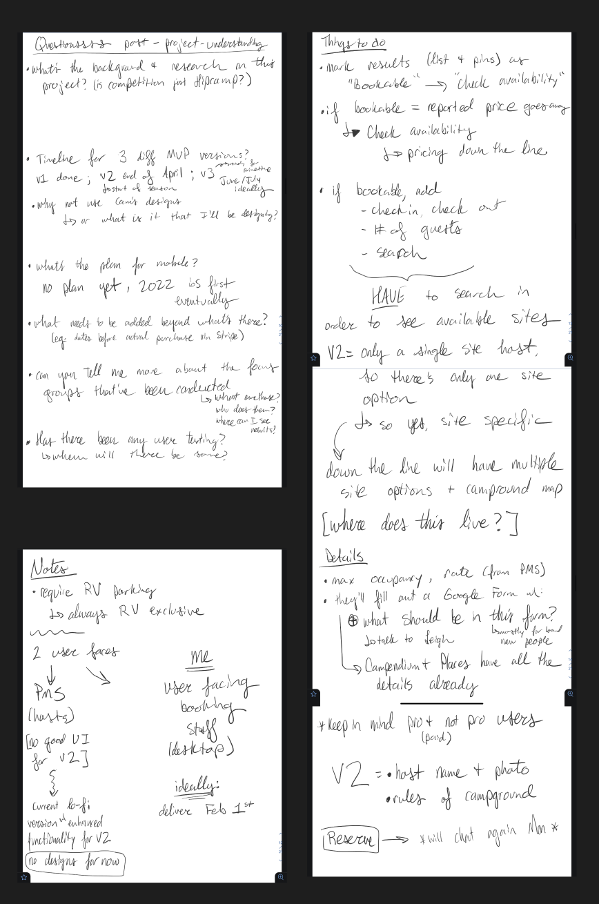
At this point I took everything I had learned and distilled it into how it could apply to Campendium. I wrote out the general flow as well as an inventory of all the different workflows I'd have to account for. I condensed all of my notes and questions to discuss with my product manager to make sure I understood everything correctly before moving on to the next step.
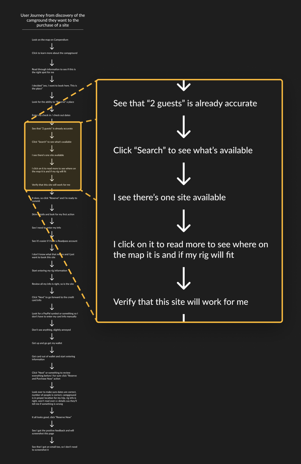
First I did one of my user journeys to account for every step a user would have to take in order to successfully find and book a campsite.
I then used my insights from that to create the overarching flow that the user would go through for the entire booking process.
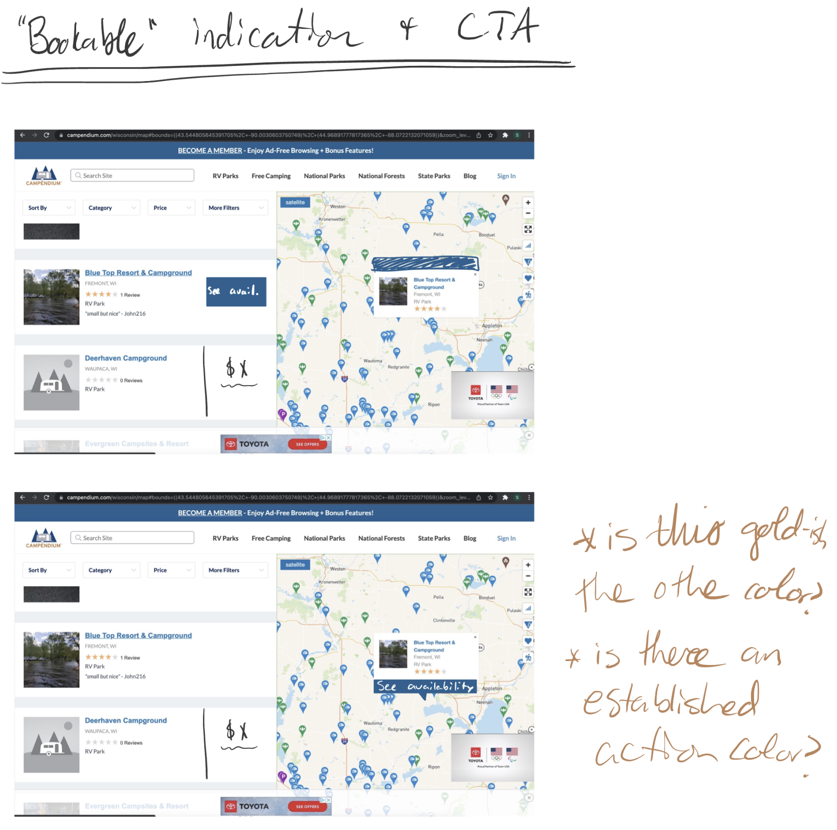
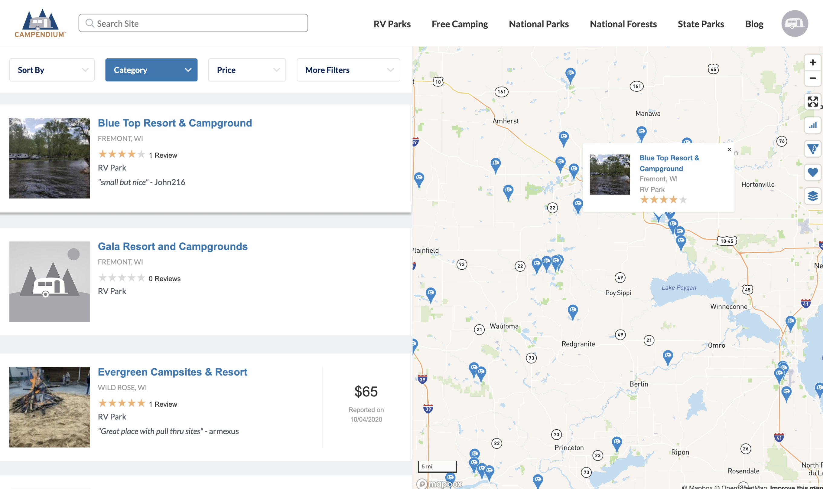
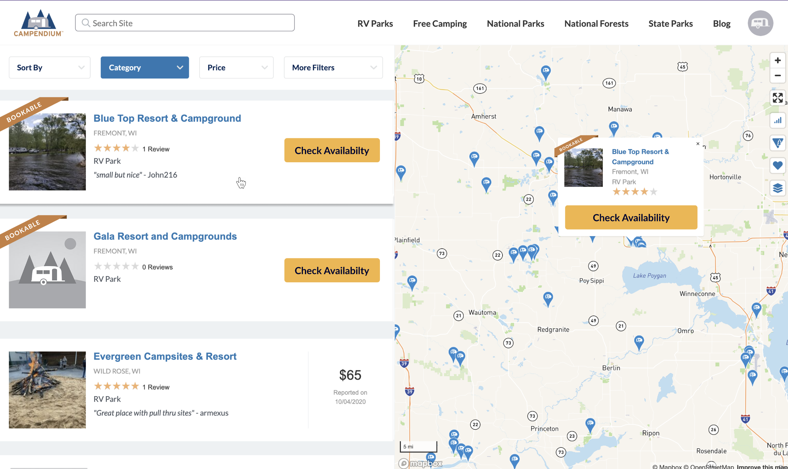
When searching for campgrounds, I aimed to incorporate a visible indication of the bookable option and a compelling call-to-action (CTA) to initiate the booking process.
Sketches
I started by playing around with where the elements could live.
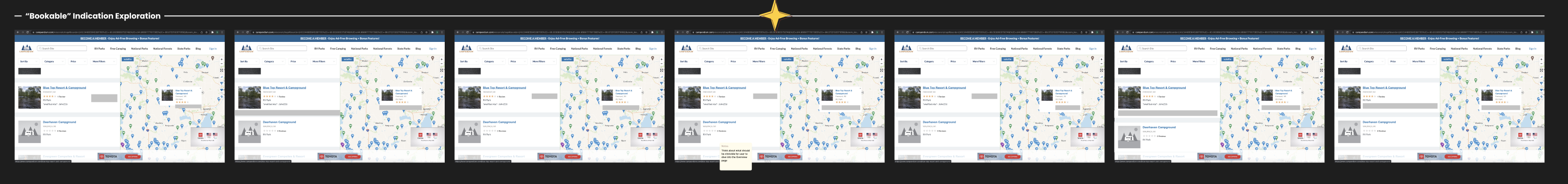
Wireframe Experimentation
Next I turned the sketches into wireframes and continued to play with placement.
Starting on the UI
Once I nailed down where I wanted everything to live, I started to see what it could look like with lo-fi mockups.
Iterating on the UI Details
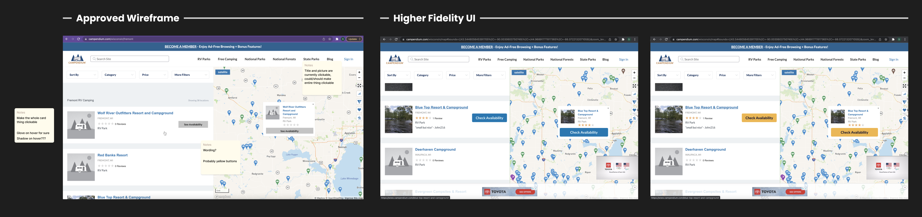
After checking in with stakeholders, I began to iterate and tweak until the final form took shape.
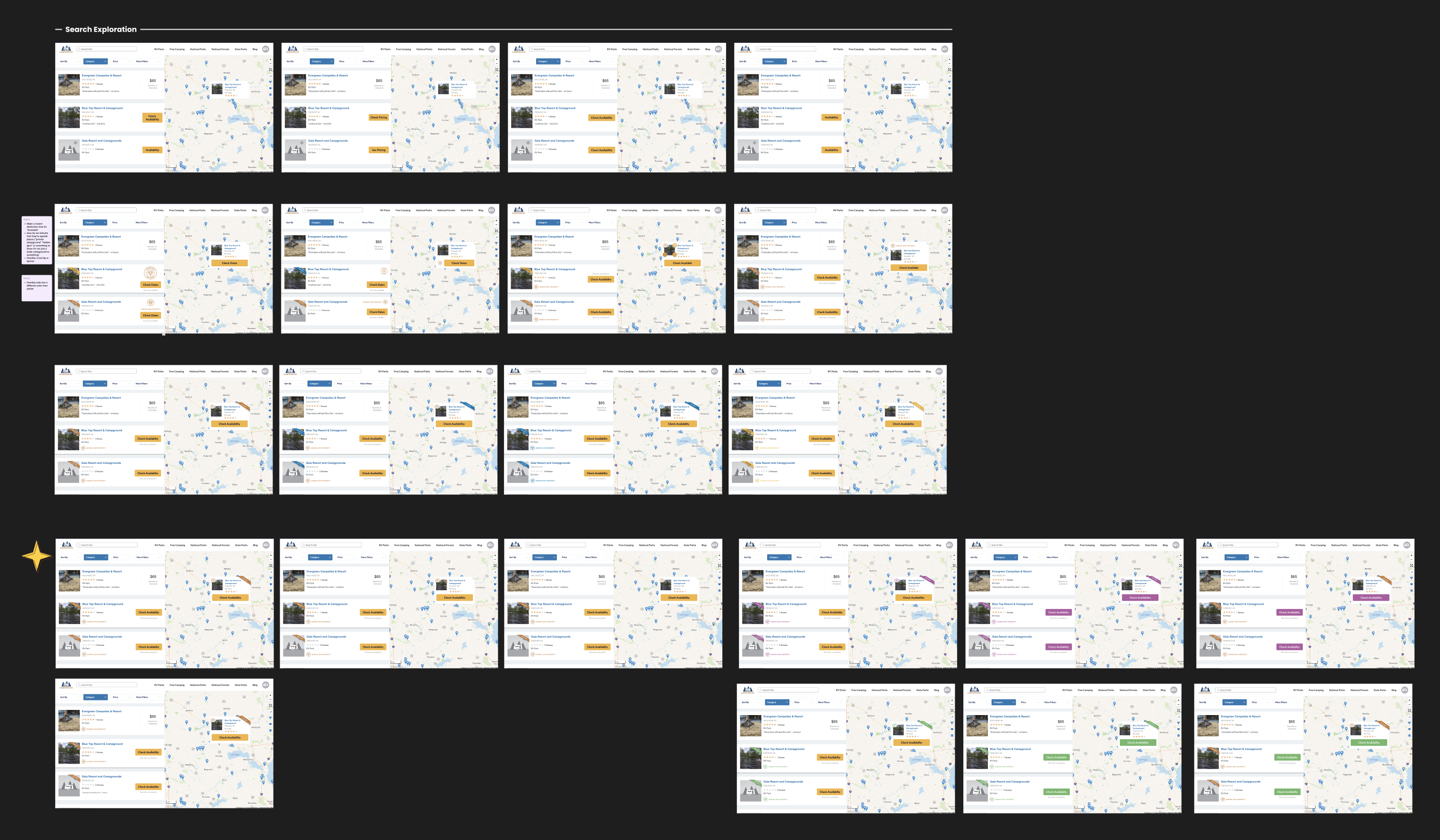
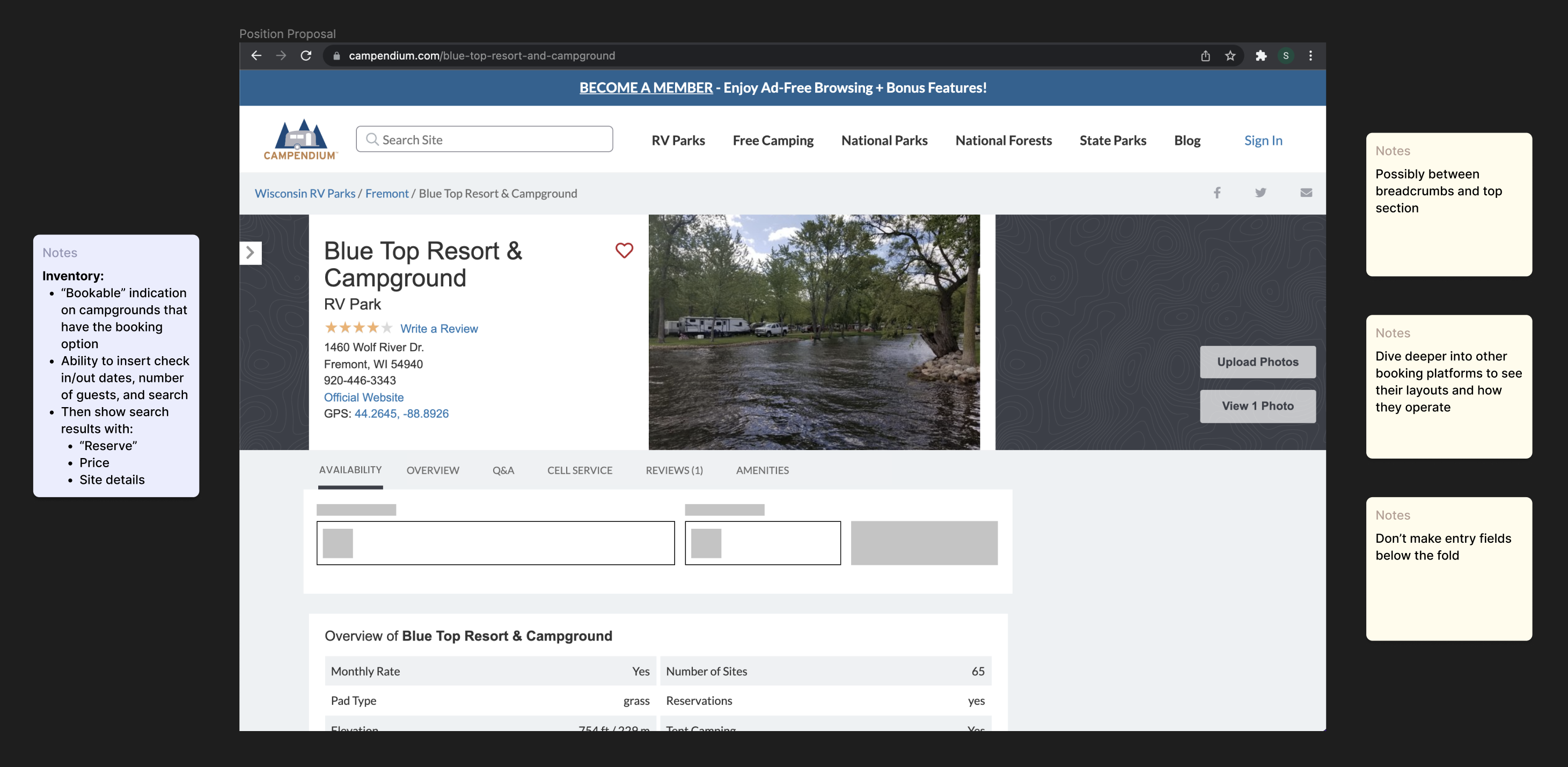
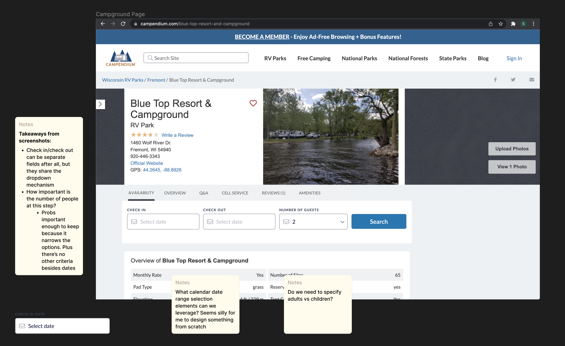
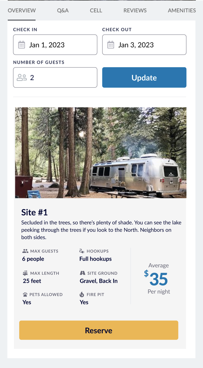
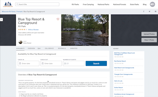
I ended creating a "Check Availability" CTA on each of the bookable campgrounds, bringing users to the new campsite search section on the main campground page. I also added a Bookable banner on the left to easily scan which campgrounds could be booked online. Additionally, I changed the results logic to always push Bookable campgrounds to the top of the list.
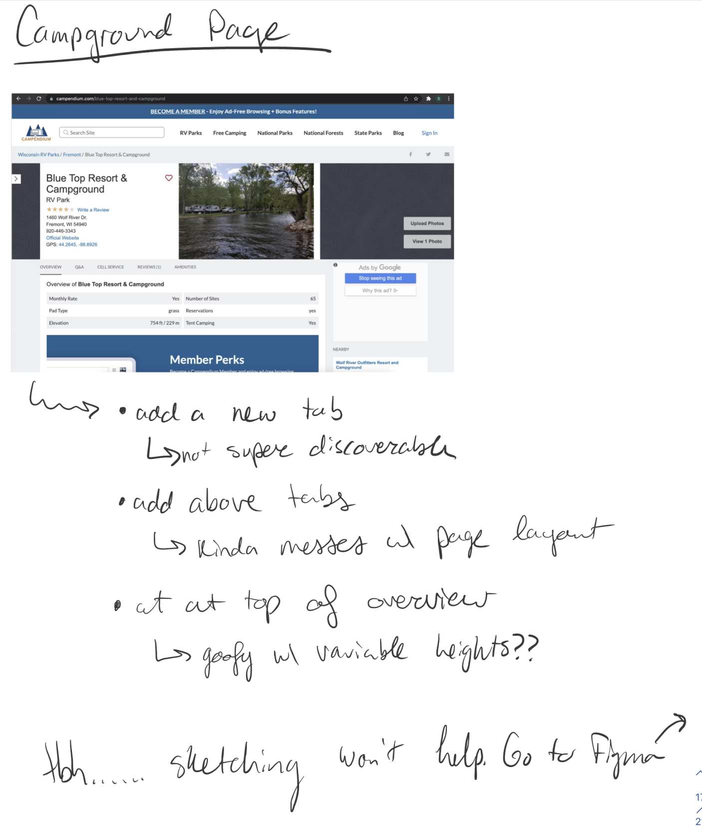
To start on this portion of the project, I first took inventory of everything needed on this page. From there I made a rough wireframe to figure out where on the page this new booking section should live. Once the team and I agreed on a placement I moved into higher fidelity UI to see how each mechanism would function.
Using the existing state, I took notes on how I could integrate the new feature.
Next I roughly laided out the wireframes for what the search flow within the section would look like.
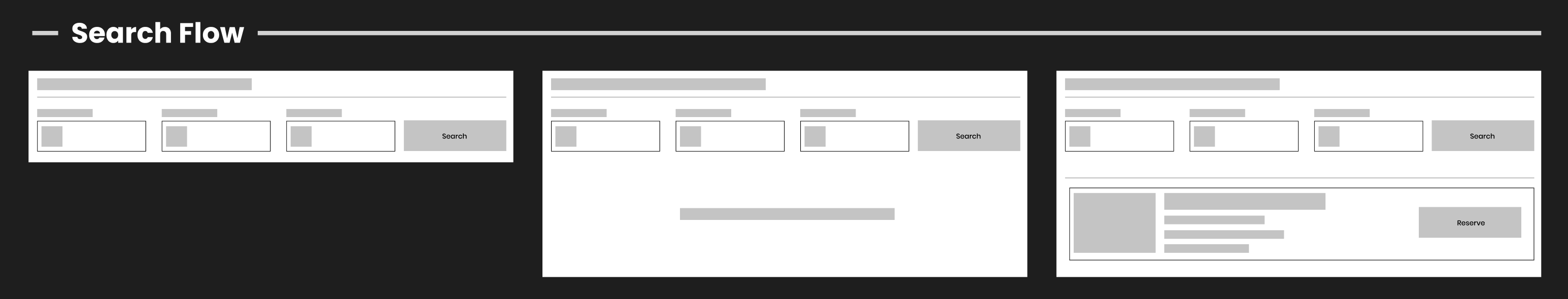
Once I got the flow together, I started to see where it might logically fit on the page.
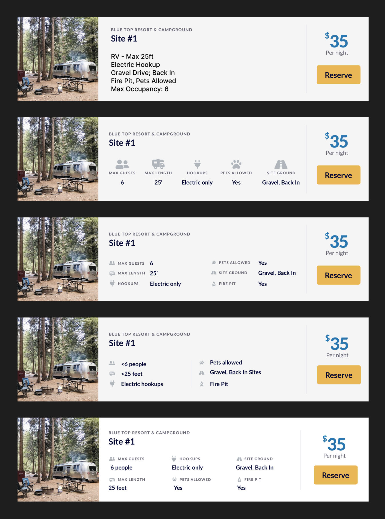
Building off the design of the campground cards from the pattern library to maintain visual consistency, I began to modify it to include all of the information needed for a specific site.
Here's a recording of the finalized prototype made in Figma. I worked extensively with the developer to get the look and feel of the date selector correct.
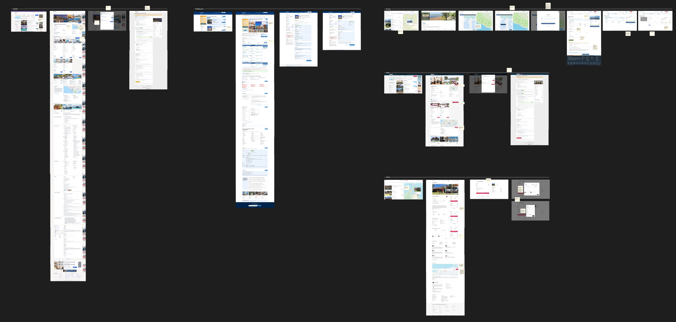
Since a checkout page can be either very complicated or very simple, I did a lot of research to see what format I wanted this checkout process to take, taking notes from various overnight booking sites (Expedia, Orbitz, AirBnb, Recreaction.gov, VRBO, etc.)
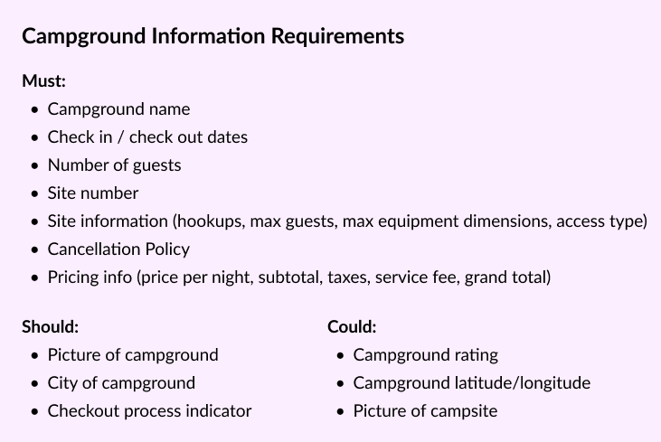
Taking Inventory
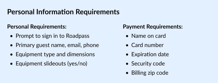
Next, I just wanted to wrap my head around everything that needed to be accounted for. I grouped information together into what we would need the customer to enter and what we would need to show to provide enough context to be confident in their purchase.
I began with a 3-step process in hopes of reducing cognitive load for the user, and because it had seemed effective in other checkout flows that I'd explored.
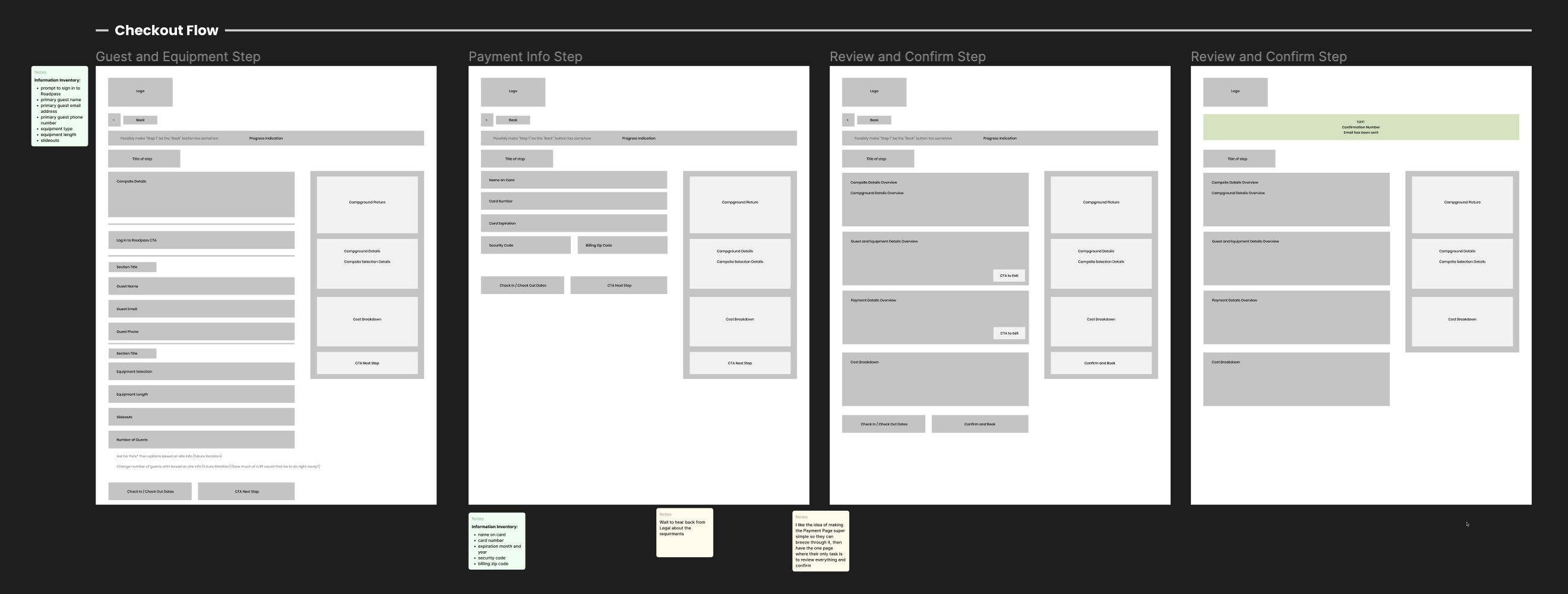
Using the designs that I created for the campsite search flow, I expanded on those patterns to maintain design consistency.
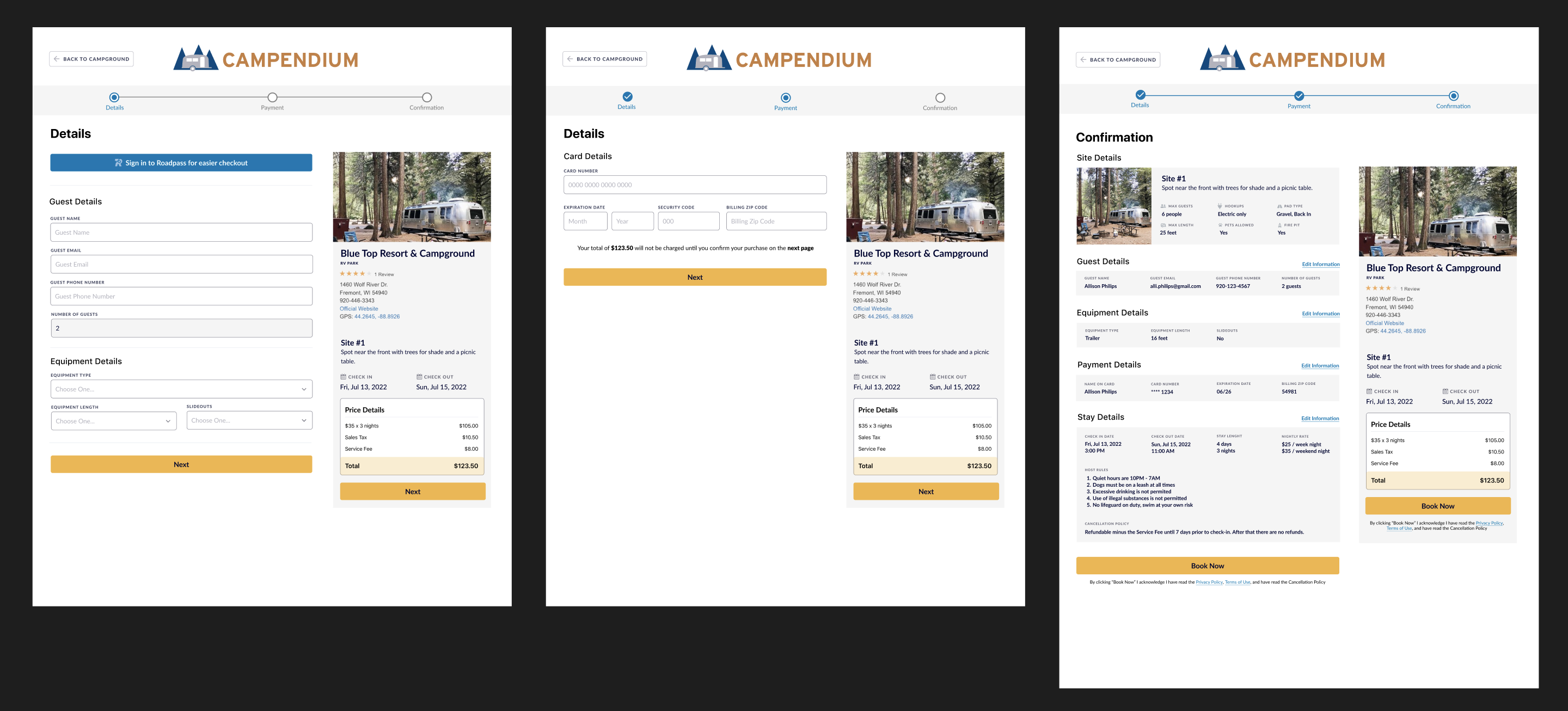
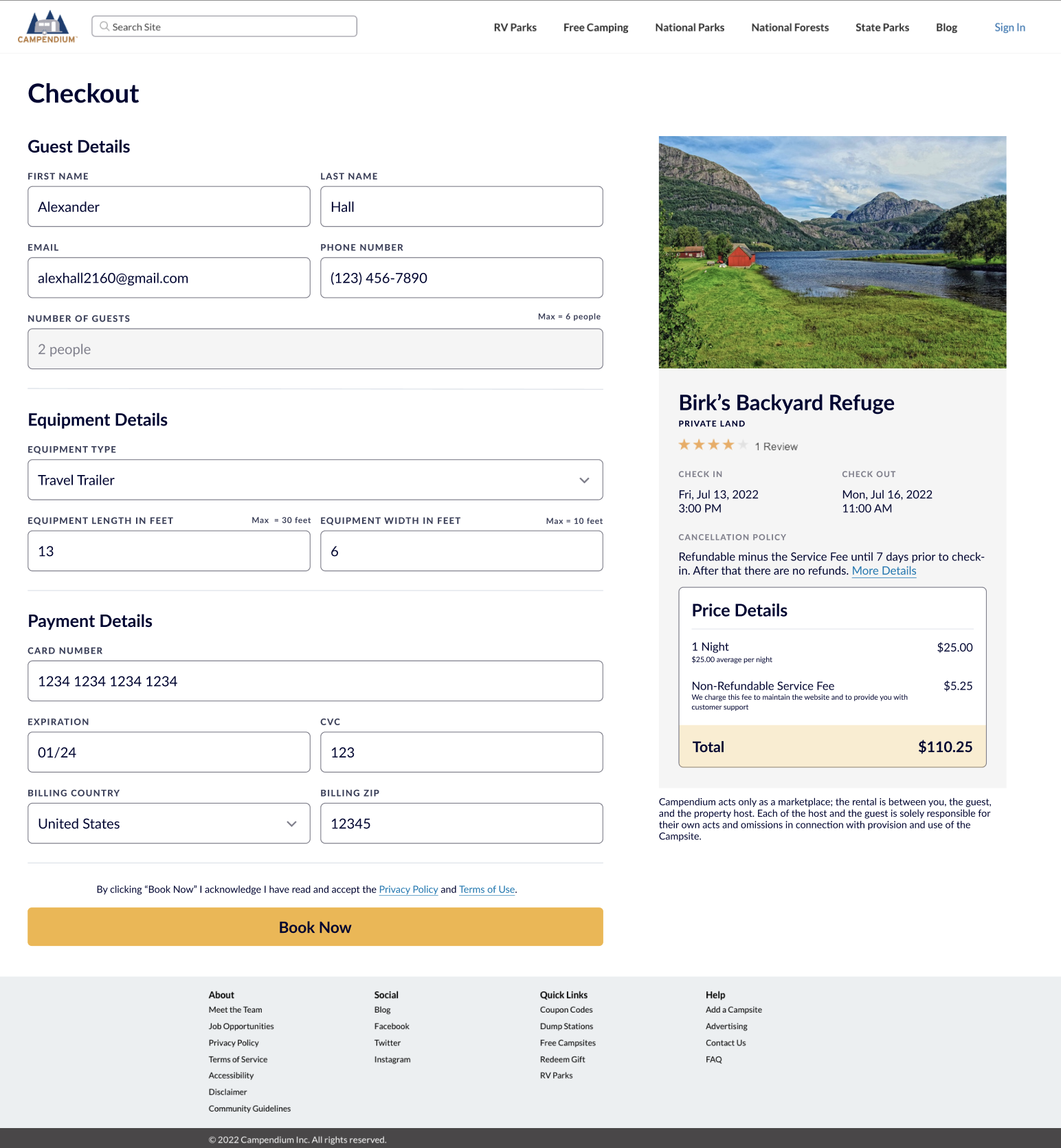
As the design progressed, I realized that having a one-page checkout would actually be the best design for the user, given the complexity and number of steps they already had to do to get here.
After dozens of design iterations, the final version emerged as a single-screen layout, enabling users to conveniently review and edit their information without navigating multiple pages.
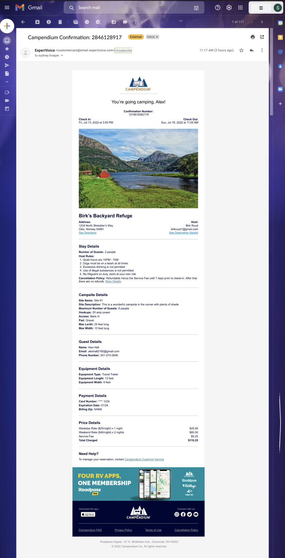
For the email confirmation, I wanted it to closely resemble the checkout page so users would already be familiar with the layout.
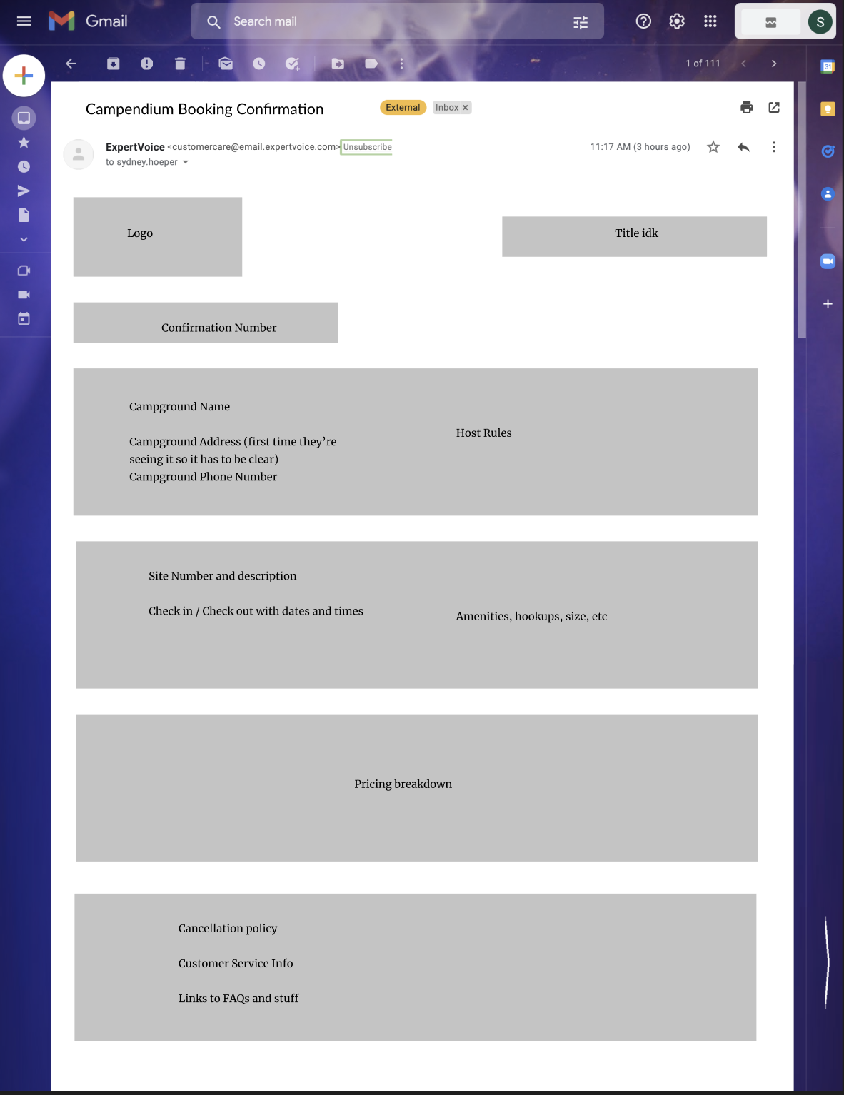
Once I got my mockups together and showed developers, we realized that I'd have to redesign the email in order to be in HTML format, due to constraints from the email-sending software.
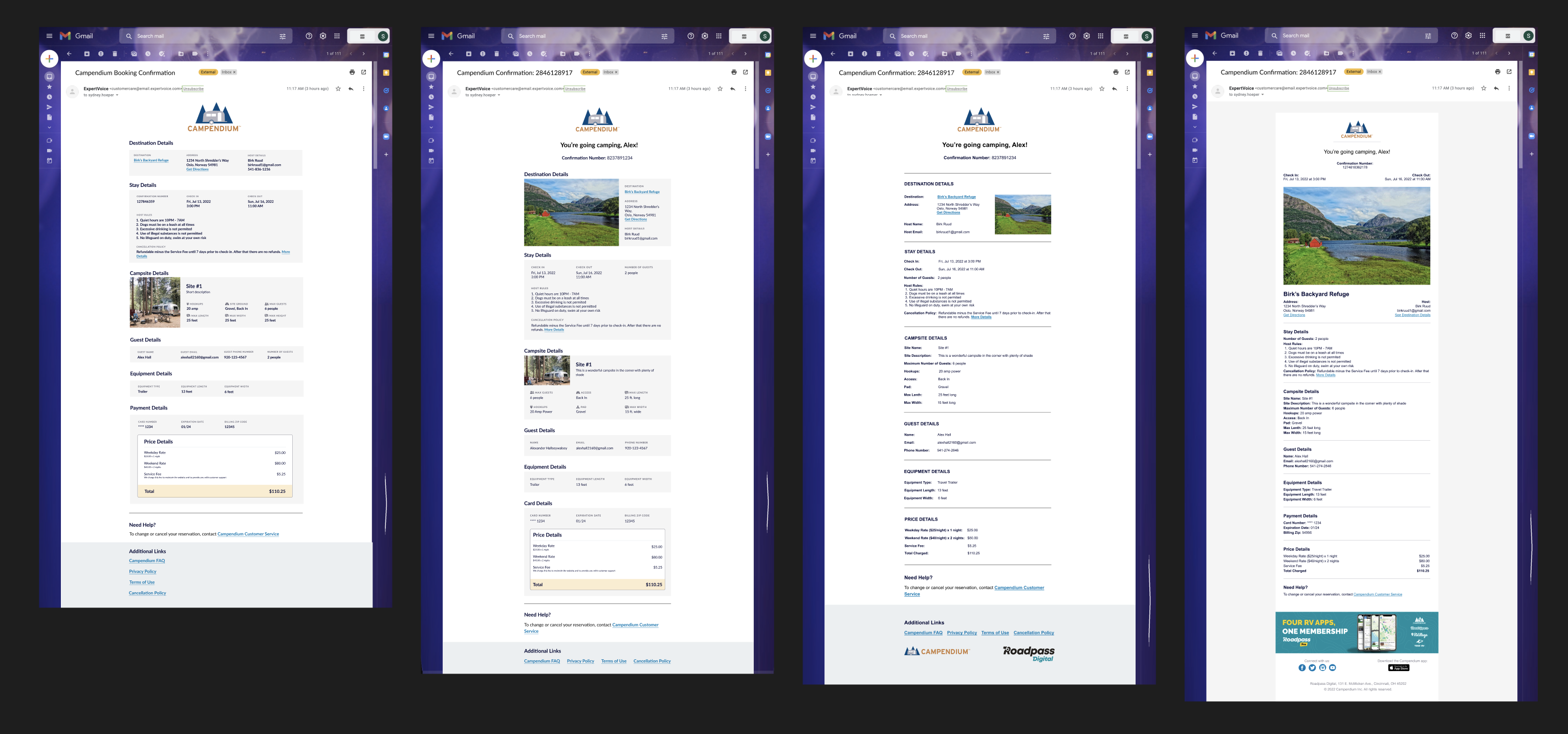
After working with the developer for multiple hours, we finally figured out how to modify the design so it would look good in both dark and light modes on all email platforms.
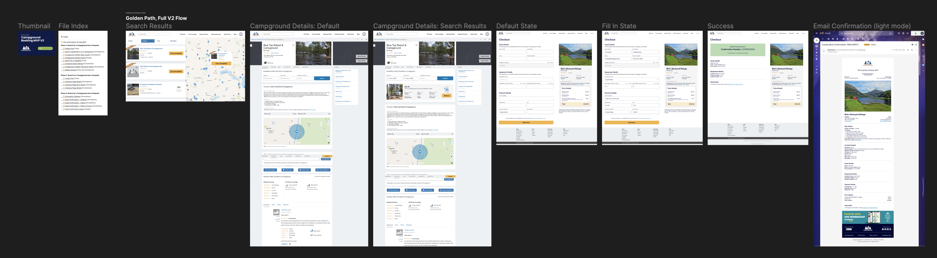
The golden path was delivered after roughly two months of designing. I broke it out into three phases, each with their own Figma page that includes all the annotations.
My annotations include: golden path flow, behavior and design details for each element on the page, designs for desktop and mobile web, and edge cases such as error states and unsuccessful purchases.
The project was slowly developed and released all at once in May 2022. From there I began working on the reservation management experience while we gathered some statistics. Because of the way the property management system was set up, we could only allow bookings on campgrounds that we had registered ourselves, which was only 7 properties across the US upon launch.
Over the following months it became clear that the company did not have the resources to recruit enough campgrounds in order to recoup the cost of the team. The following spring Roadpass Digitial went through a round of layoffs, eliminating the entire development team that worked on this project, and I was redirected to a different brand within the company, while this entire project was unfortunately removed from Campendium.

