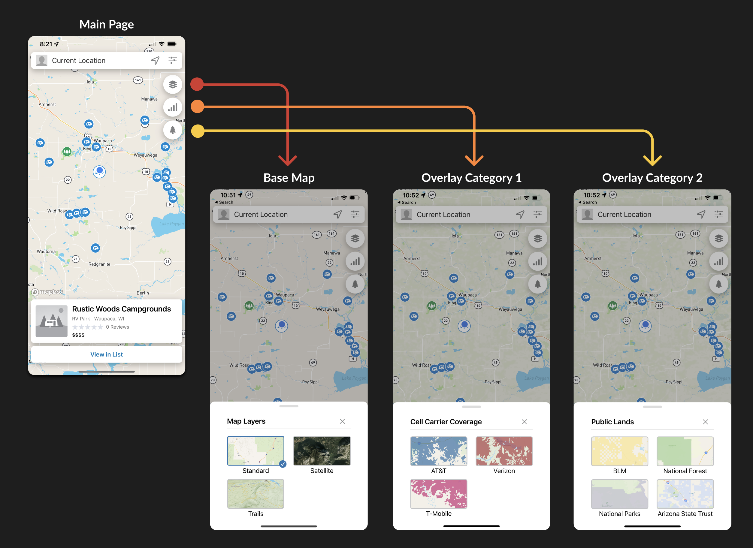
Redesign how users apply informational overlays to their map
I took the existing disjointed experience and simplified the map layer selection process for both desktop and native mobile
Campendium is the leading campground listing and reviews website and mobile app.
As the only product designer on the Campendium team, I was tasked to add a smoke map overlay to help campers avoid wildfire smoke.
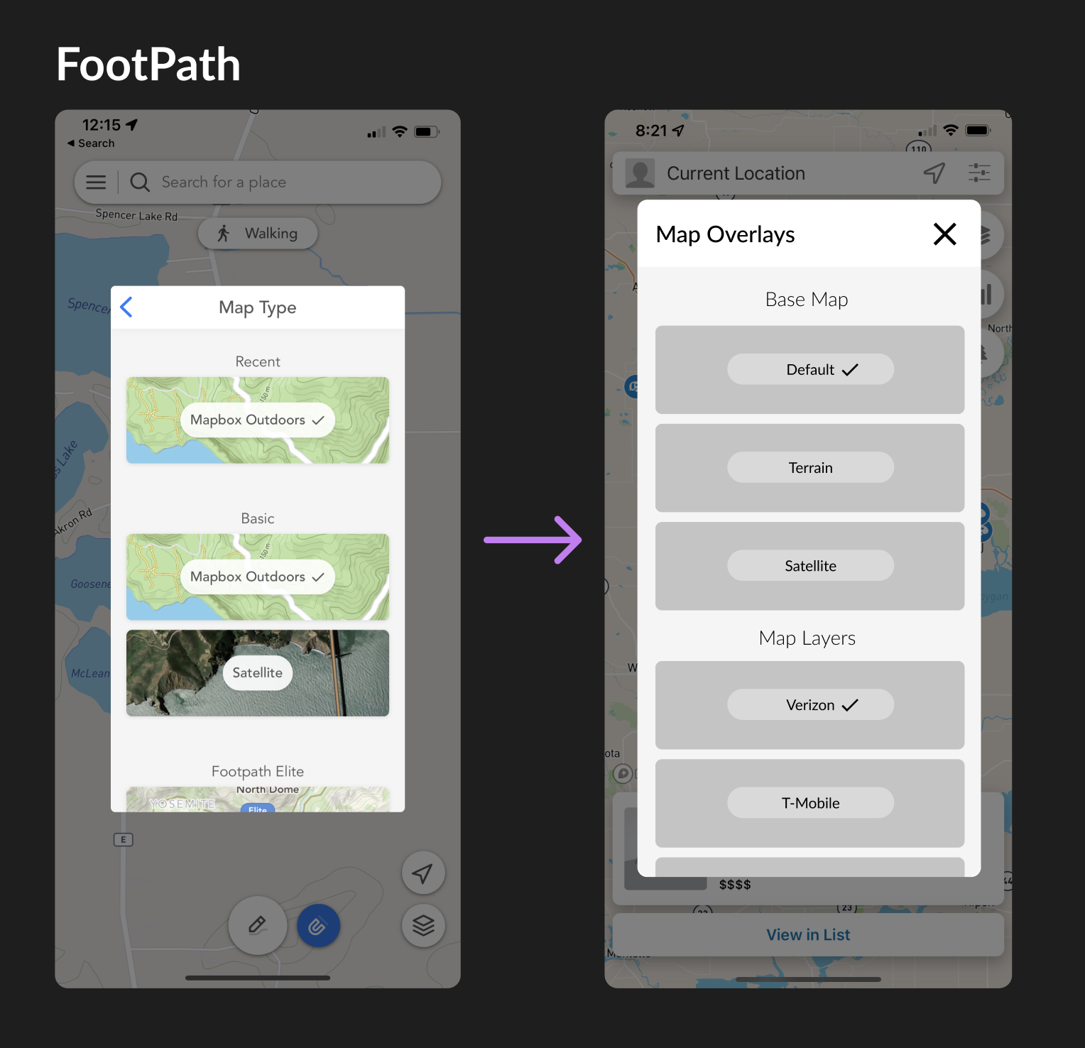
Immediately, I realized that the entire mechanism for selecting map overlays needed to be redesigned.
Role: Product Designer
Skills Used: User research, competitive analysis, wireframing, low and high fidelity mockups, interaction design, prototyping, cross-team collaboration
Tools used: Figma, Usertesting.com
Timeframe: ~1 month, 2022
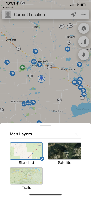
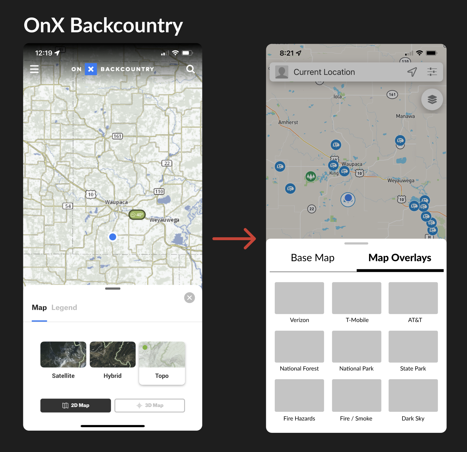
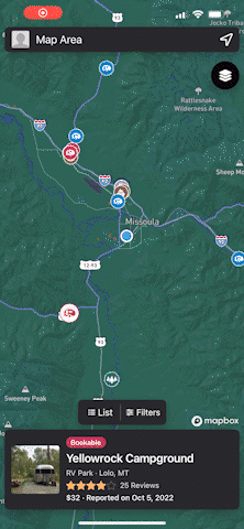
In production, there were three separate floating action buttons (FABs) in the top left of the map, each representing a different category of map layer.
The existing map overlay selection mechanisms were disjointed, lacking a clear category for the new Smoke overlay to live. Adding more overlays in the future would exacerbate the issue, so I knew I had to redesign the entire mechanism for selecting overlays.
Map overlays are the highest converting feature for Campendium's freemium business model, so I knew if we improved this experience, the conversion rate would increase even further.
Working with my product manager, we came up with a list of requirements for the minimum viable product (MVP) and the pieces that would immediately follow the initial release
Phase 1 (MVP):
Phase 2:
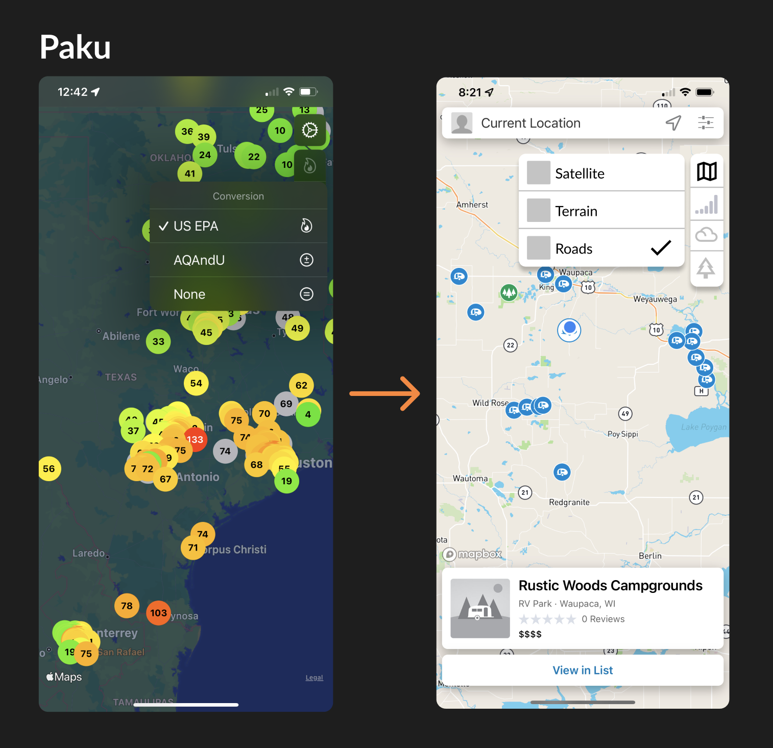
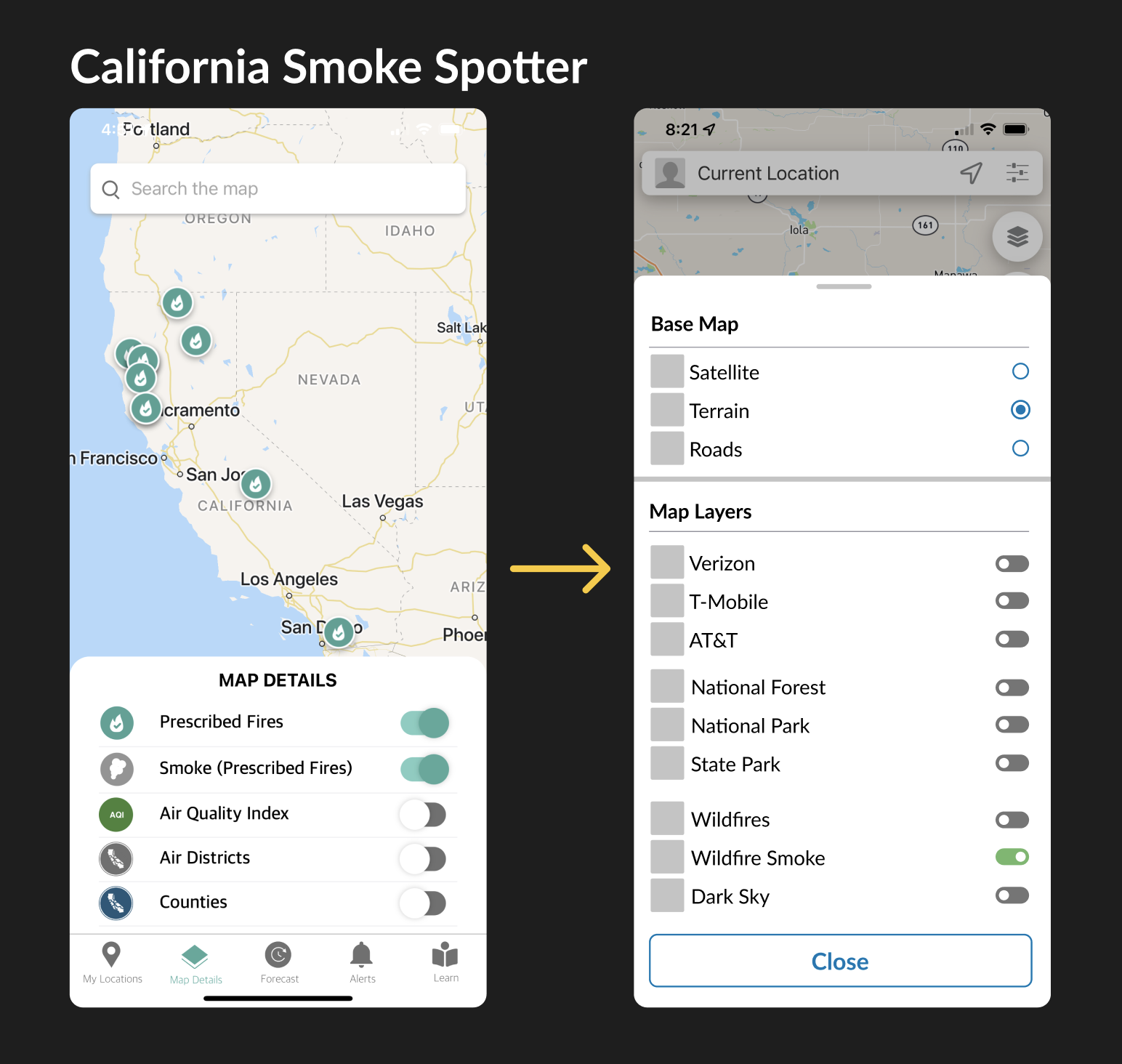
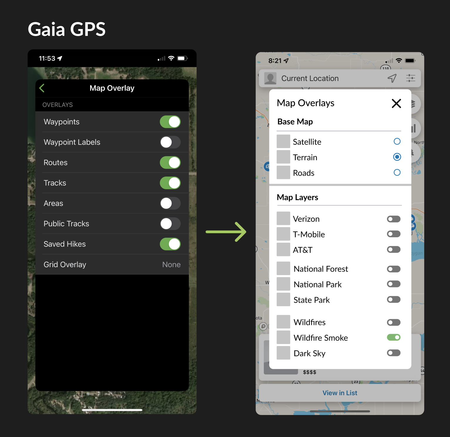
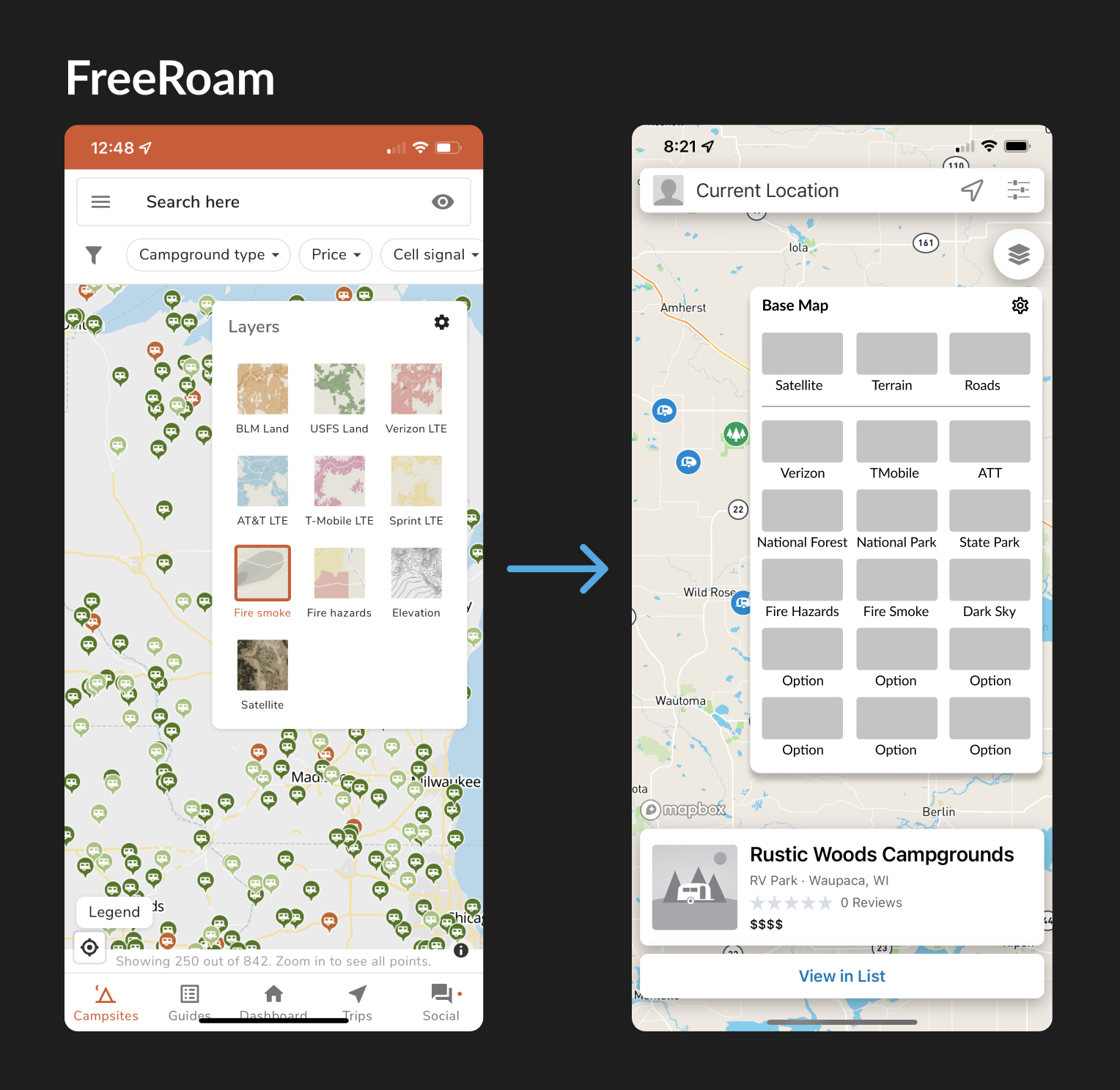
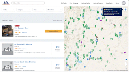
I conducted an extensive competitive analysis by exploring 13 different mapping, weather, and fire-related apps to gain insights into existing patterns and identify suitable approaches.
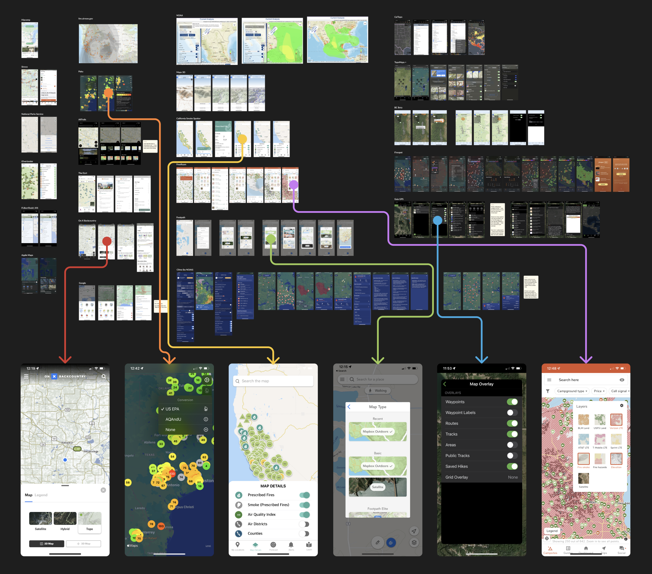
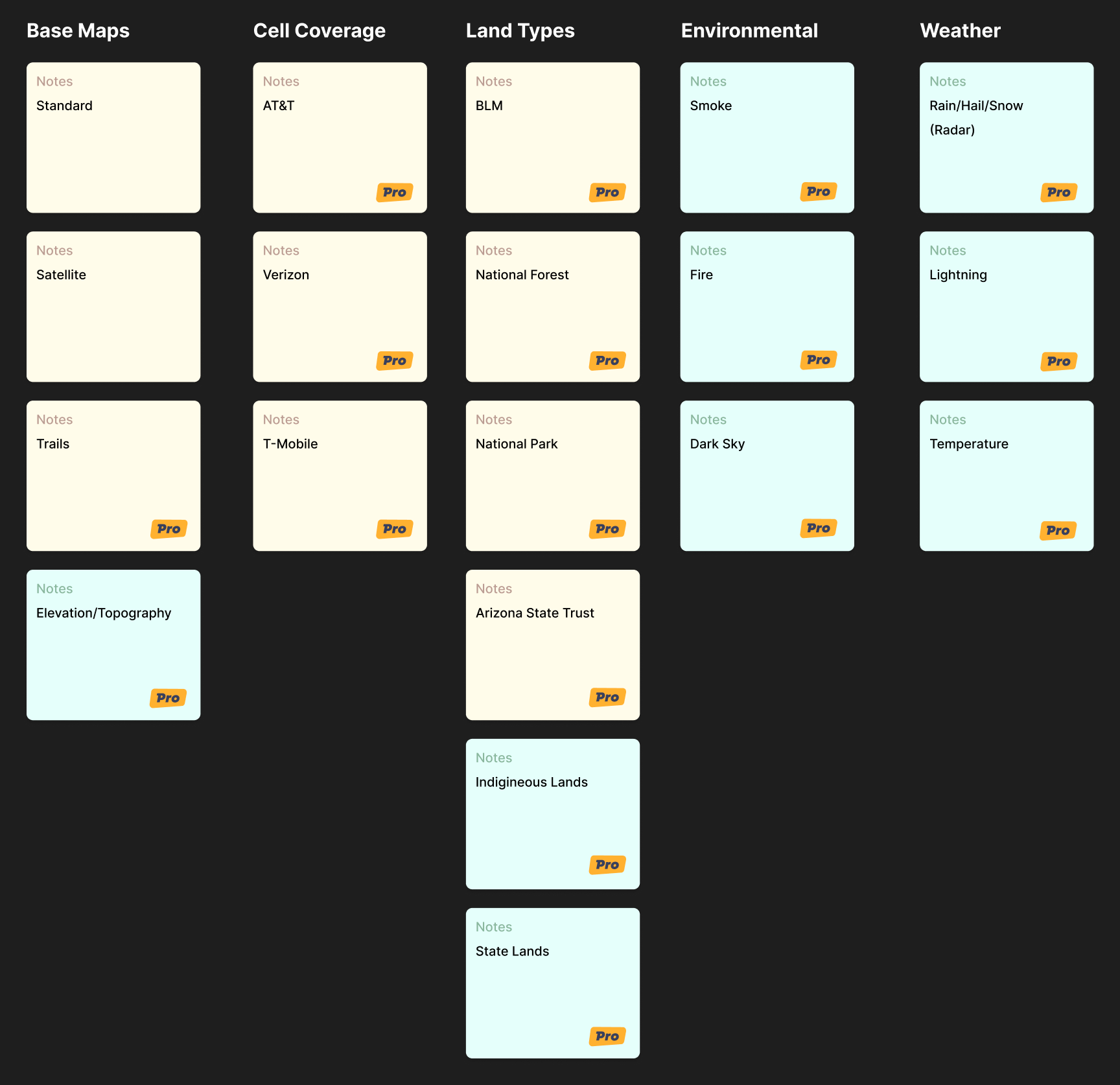
First, I took inventory of our current (yellow) and future (green) overlays, grouping them into categories to design for the ideal future state.
Next, I interviewed 4 people in the company who were full-time RVers to learn about how they choose their campsites, which built on top of my former knowledge and experience as an RVer.
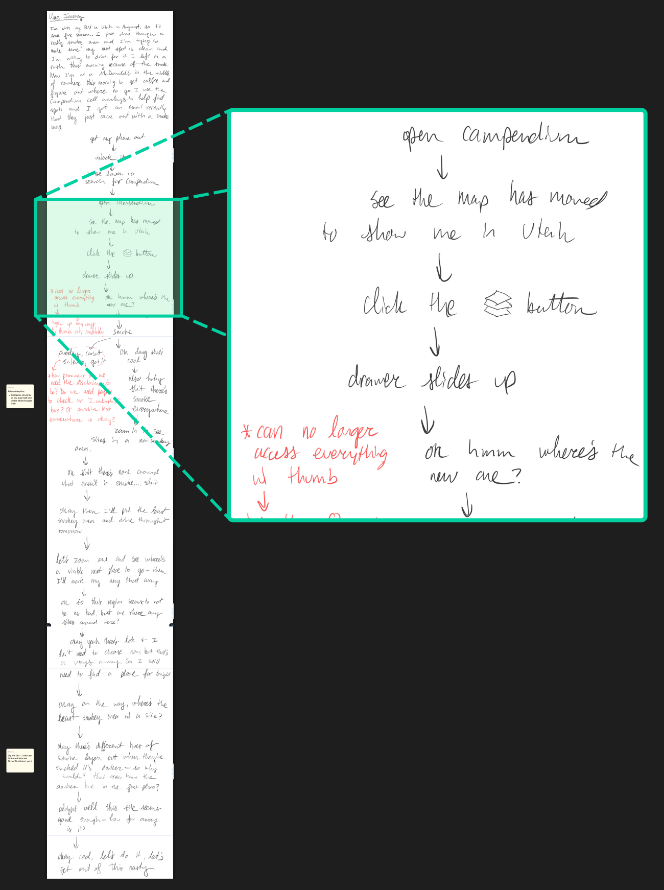
Then, I created a user journey to gain detailed insights into user behavior, considering their location, mental state, device, and objectives while interacting with the map. Drawing from personal experiences, I documented step-by-step details to gather ideas and enhance the user experience by minimizing friction.
I took the most promising map layer patterns from my competitive analysis and recreated them as wireframes within our app's framework. This enabled me to discern the aspects that had potential for our app and take note of the aspects that would not be suitable.
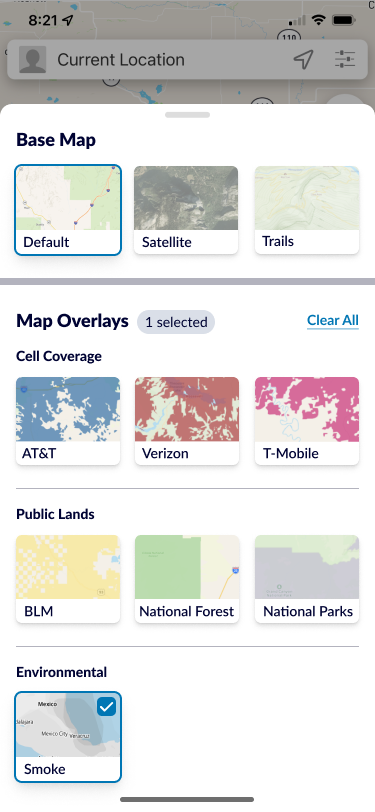
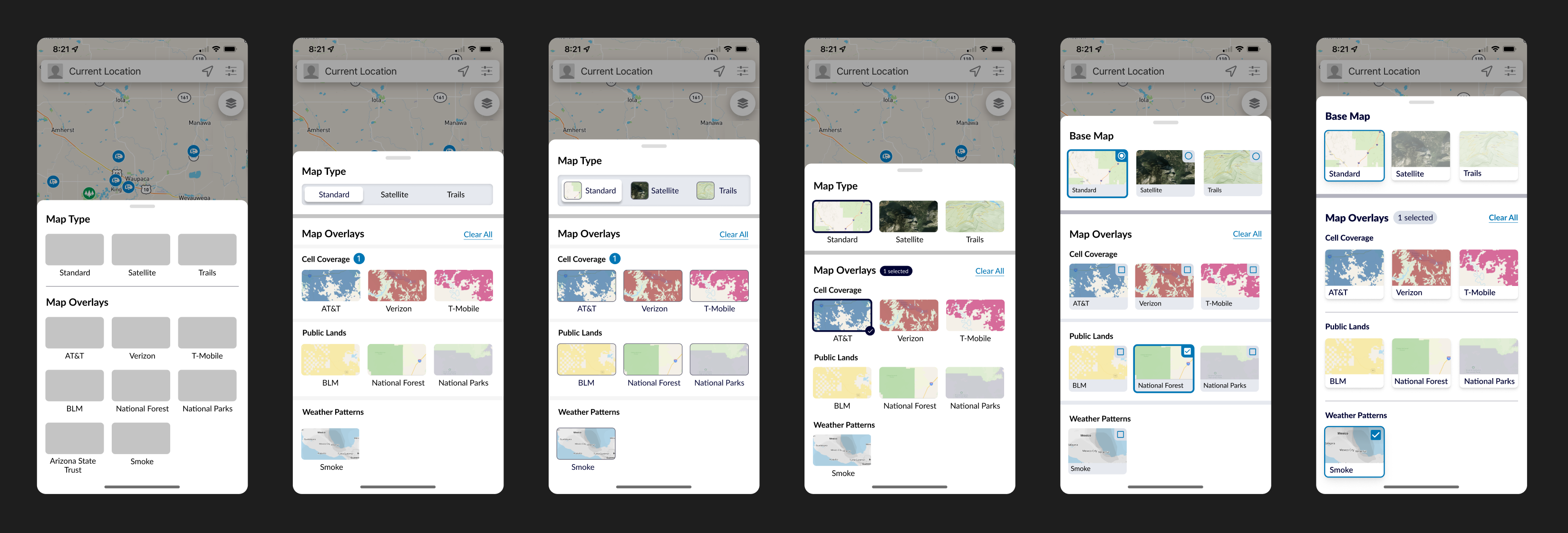
Following more wireframe experimentation and collaborative discussions with the design department head, other designers, and my product manager, I decided to move forward with a slide-up drawer and tiles.
I opted for the slide-up drawer because it:
I opted for the tiles because they:
Next, I started to make higher fidelity UI as I continued experimenting with layouts, sizings, grouping, and selection mechanism. At this stage I shared designs updates daily with the head of design and my product manager until I got the interface to where we were all happy with it.
A few steps in the evolution of the user interface:
An overview of the evolution of the user interface:
Once the UI was figured out, then I created a high-fidelity prototype in Figma to experiment with getting the interactions to look and feel right.
The biggest challenge was making it intuitive for users that only one base map could be selected at a time, while multiple overlays can be applied at once.
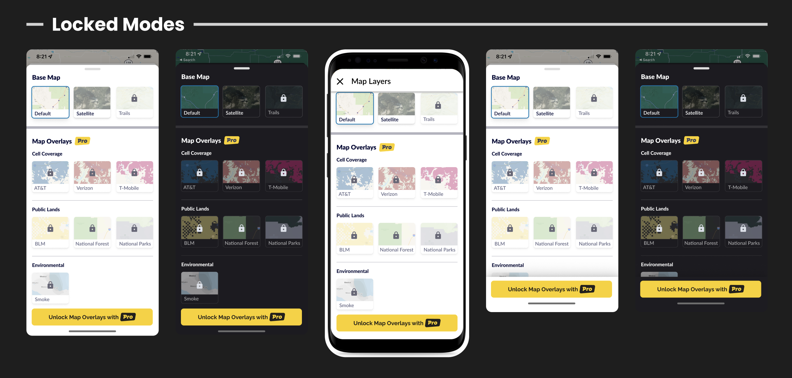
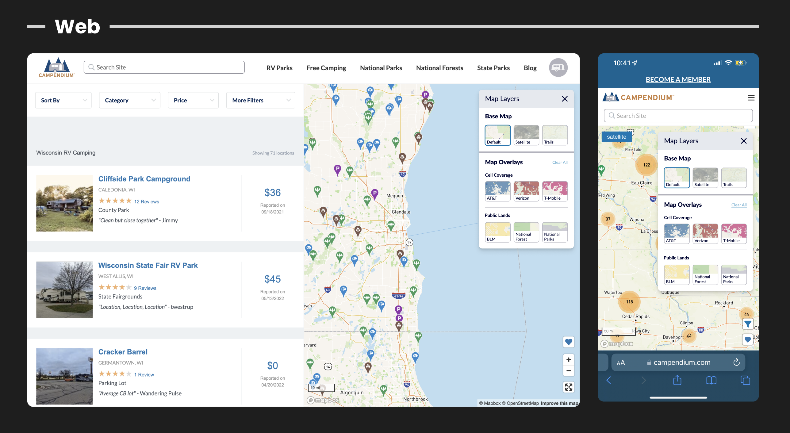
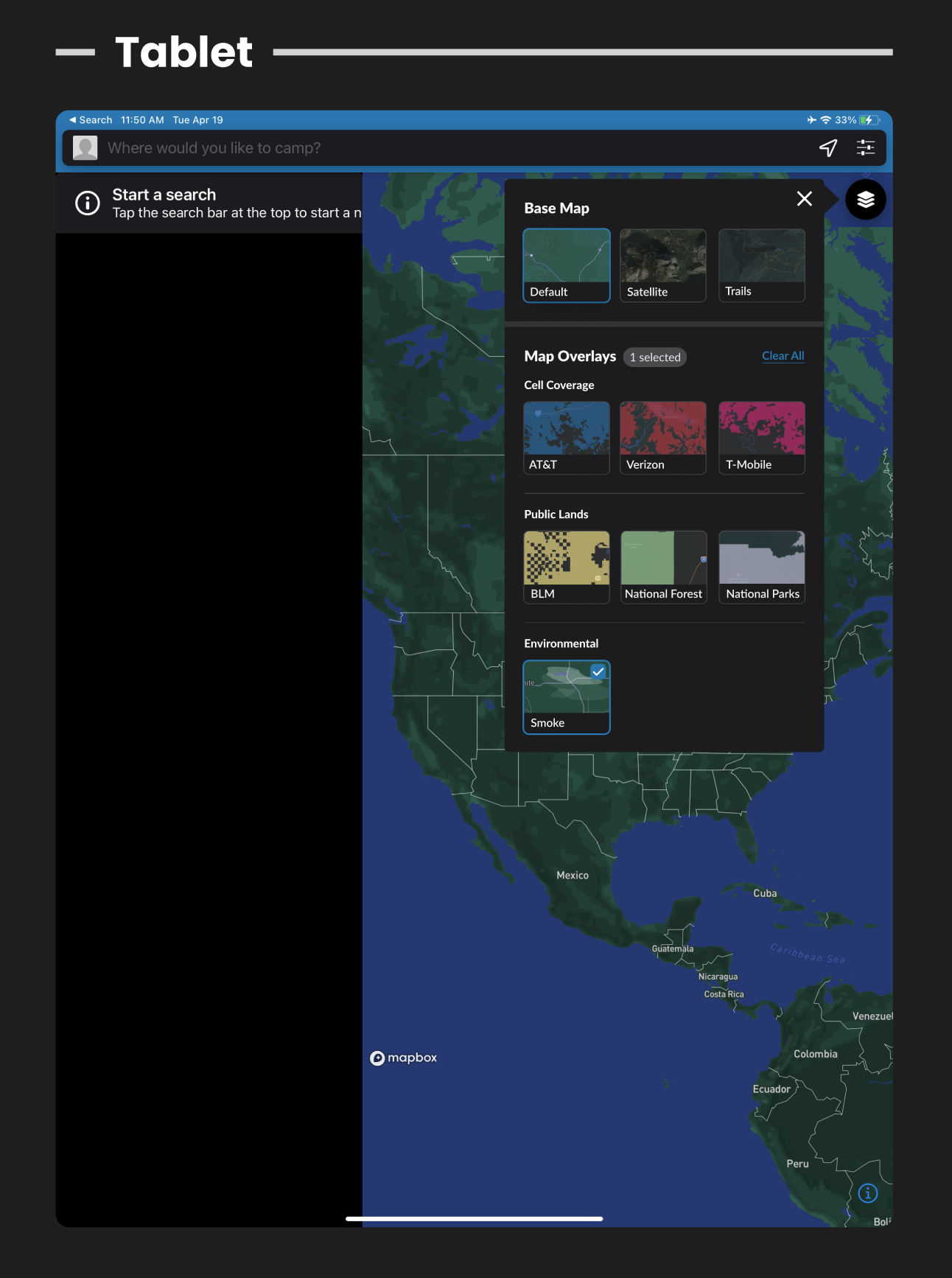
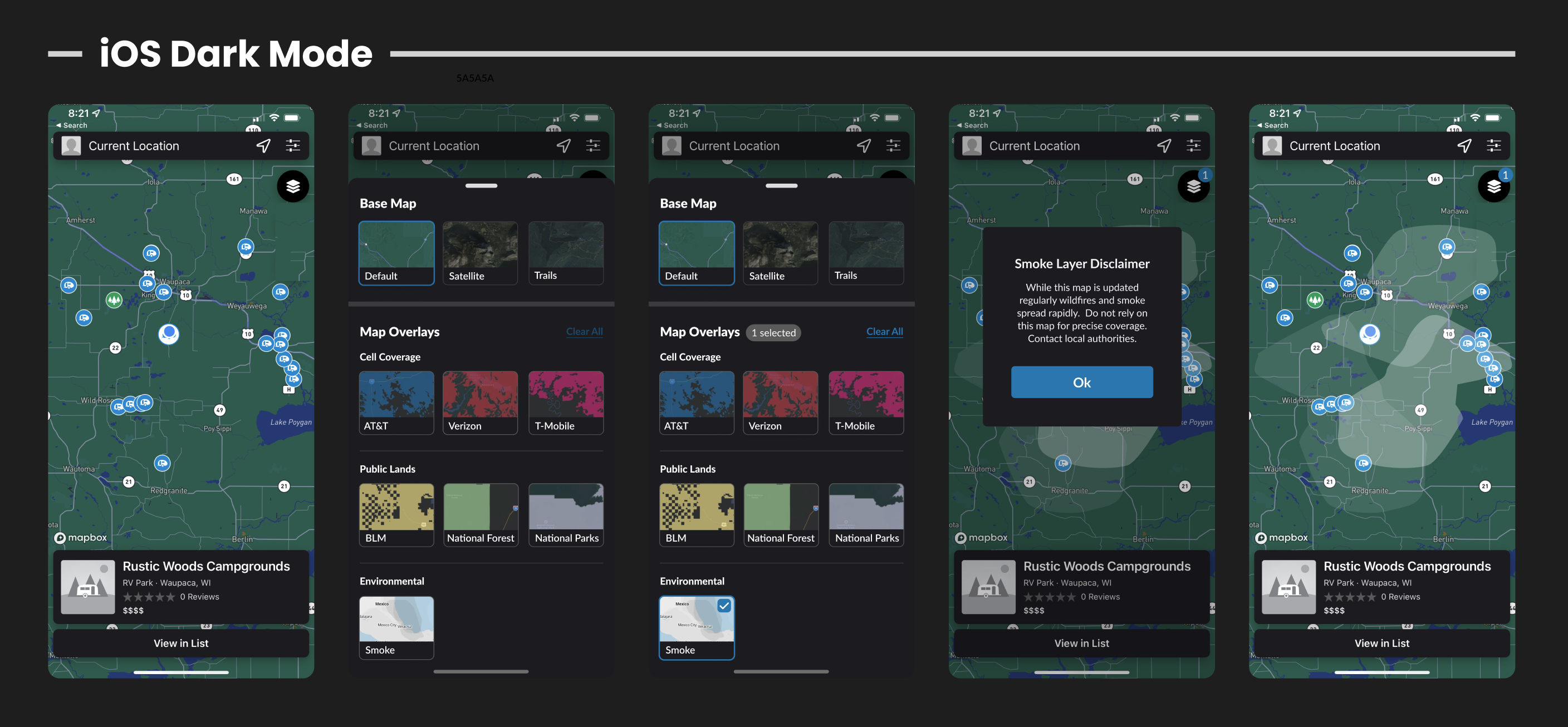
I also had to design for all scenarios instead of just iOS Light mode.
These designs included:
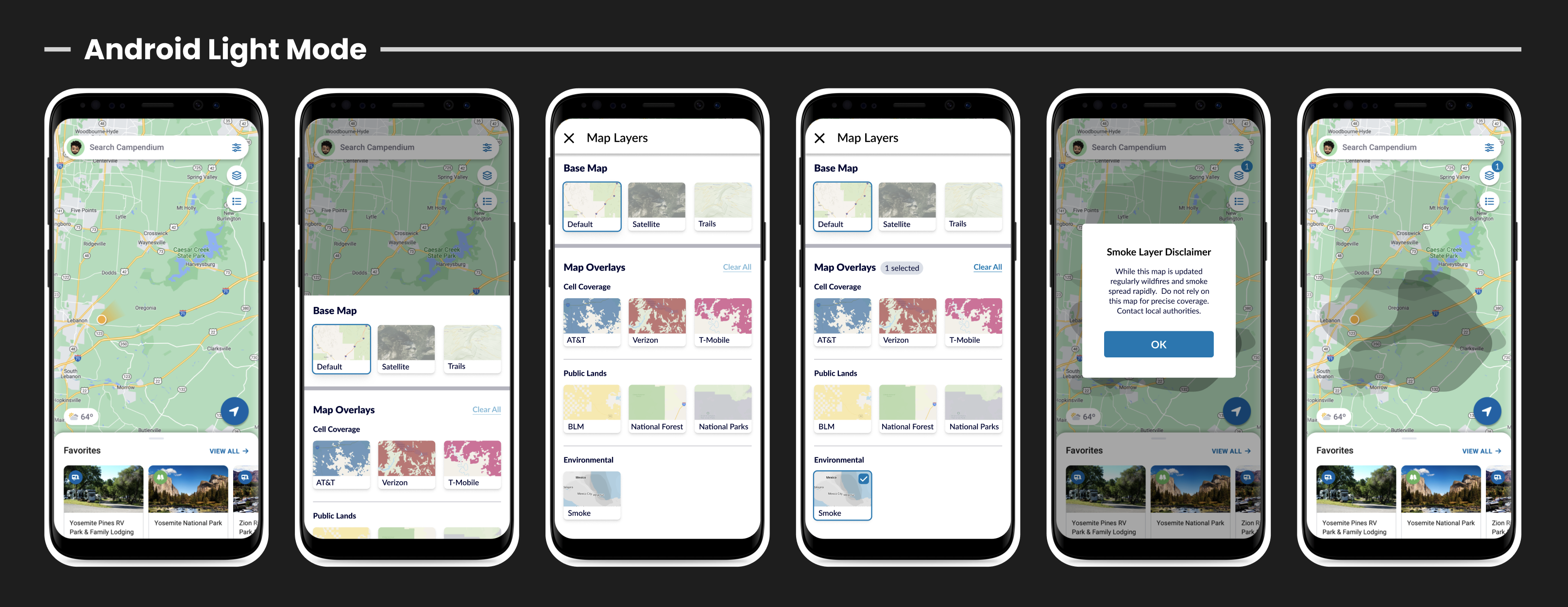
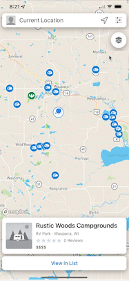
The feature was released in multiple phases, with the first one being the UI update on iOS and Android. Next would come the smoke overlay itself along with the disclaimer.
The map overlays mechanism was updated on responsive web a few weeks later.
The redesigned map overlays, including the Smoke Map Layer, successfully addressed design challenges and contributed to increased conversion rates and user engagement. While a few team members were worried that users would be confused by the new navigation, the contrary was true: people were expressing their excitement of the improvement.
The design has been in production for approximately a year, performing exceptionally well. This project remains a personal favorite, showcasing a seamless and scalable design solution.


 View resume as PDF