Allows users to add waypoints to their trips from search results
I improved Roadtrippers' desktop search results by enabling users to easily add results to their trips and aligning the UI with the mobile design
Roadtrippers is a desktop and mobile app helping people plan and curate epic road trips.
Our team's objective was to increase the number of waypoints added to trips. After successfully implementing an "Add to Trip" button on mobile point-of-interest (POI) cards, I was responsible for adding the same button to desktop POI cards to maintain a consistent user experience across platforms.
Role: Product Designer
Skills Used: User testing, user research, wireframing, low and high fidelity mockups, interaction design, prototyping, cross-team collaboration
Tools used: Figma, Usertesting.com
Timeframe: ~2 weeks, 2023
To accomplish our team's metric of increasing waypoints added to trips, we conducted user tests on Usertesting.com, examining 20 videos of users across mobile platforms (Android and iOS) and user types (existing Roadtrippers users and new users).
Users
Remote Testing
Cohorts
Through video analysis, I identified the need for a more streamlined process for getting waypoints added to a trip. The other designer and I determined that adding a "Add Waypoint to Trip" call-to-action (CTA) button directly on the POI cards would be the simplest and most intuitive way to optimize the flow. It was designed and launched, leading to a 12.16% increase in the number of waypoints added to trips by new users.
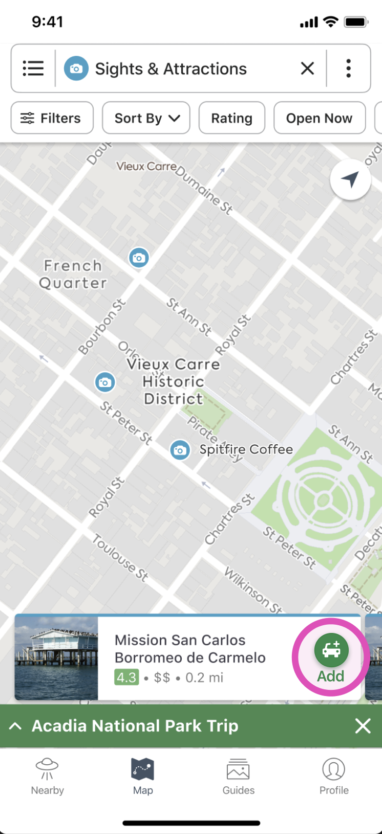
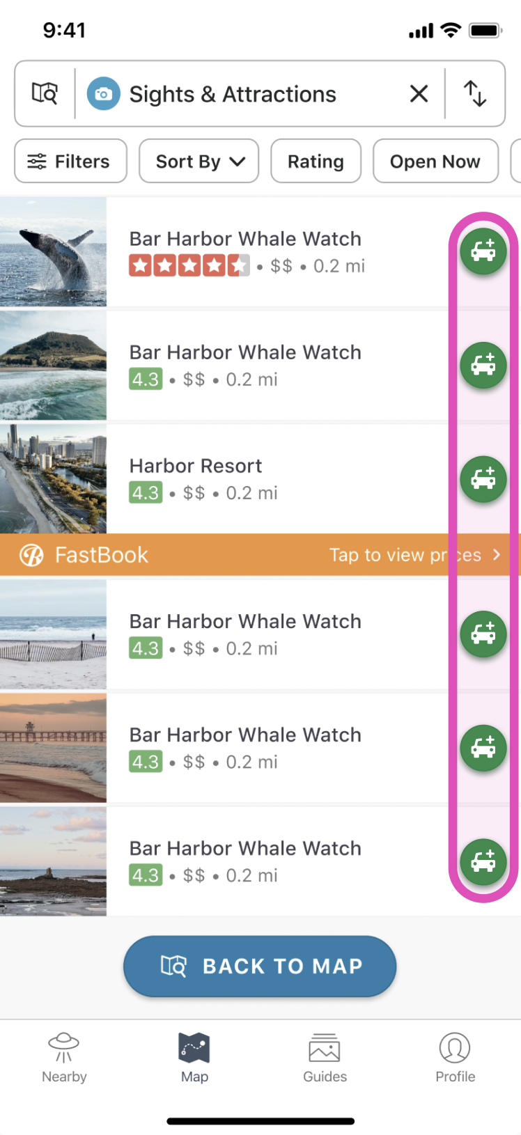
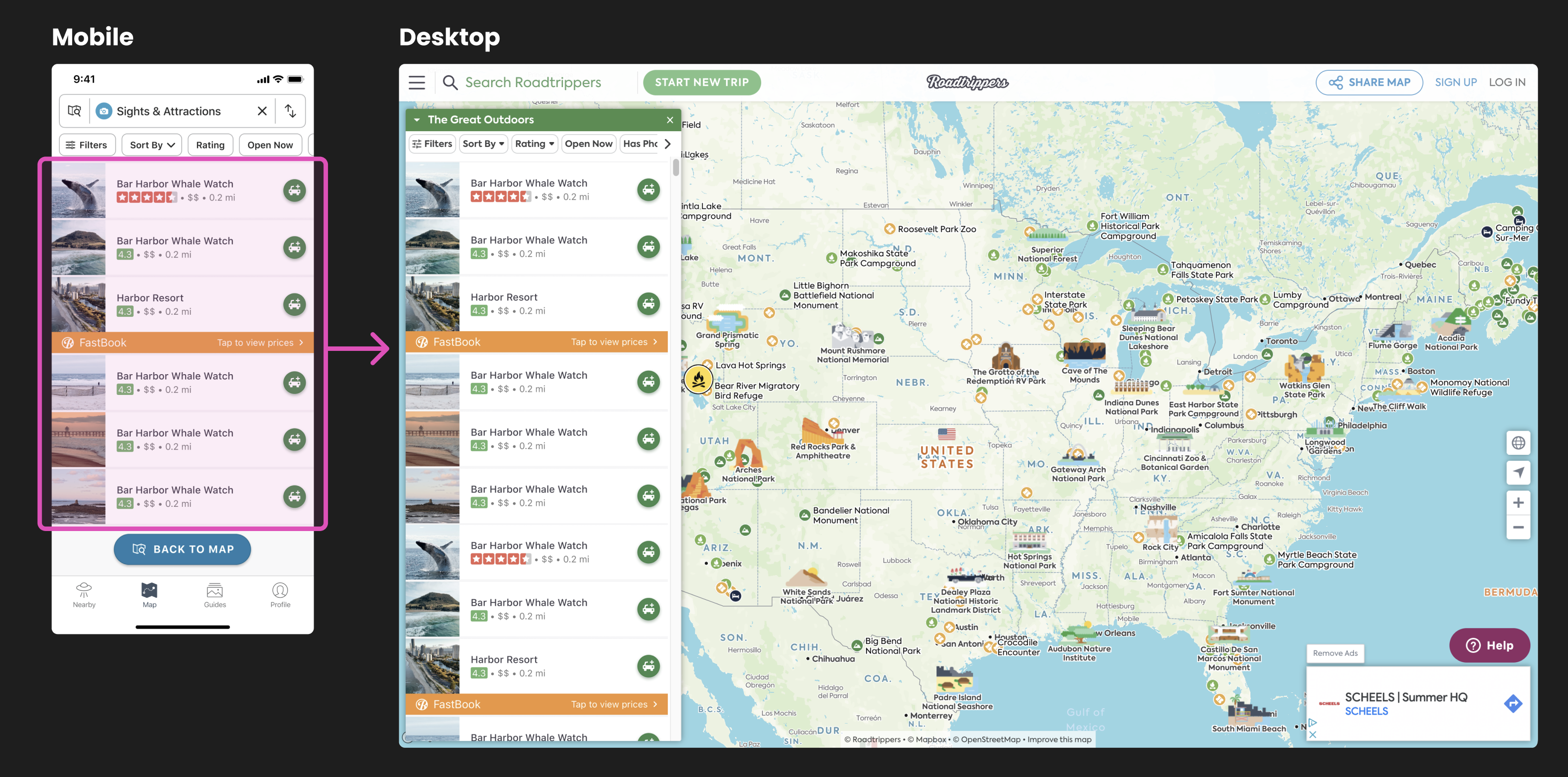
Desktop needed the same CTA implementation that we'd added to mobile in order to increase the number of new users who add a third waypoint.
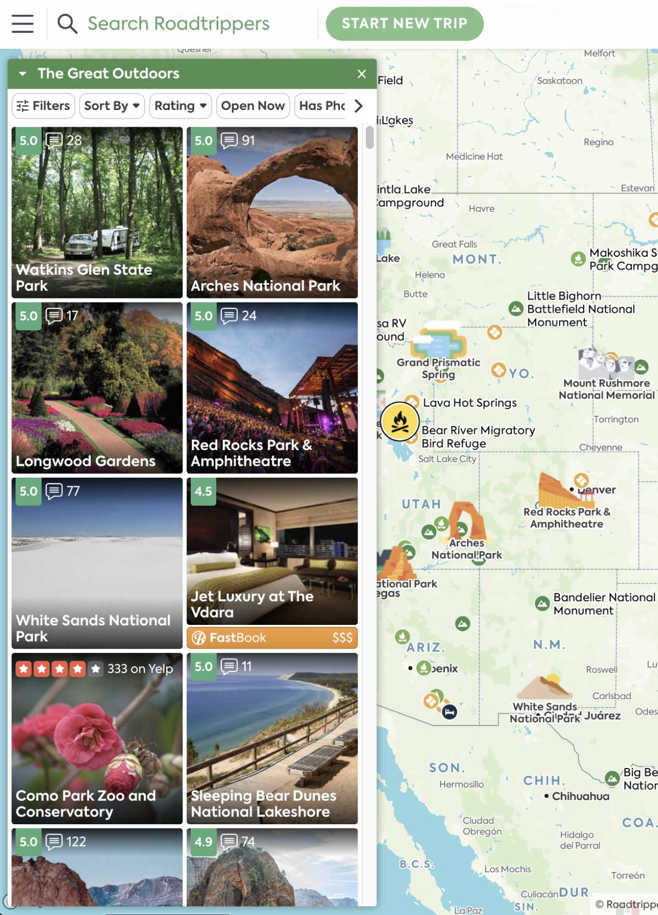
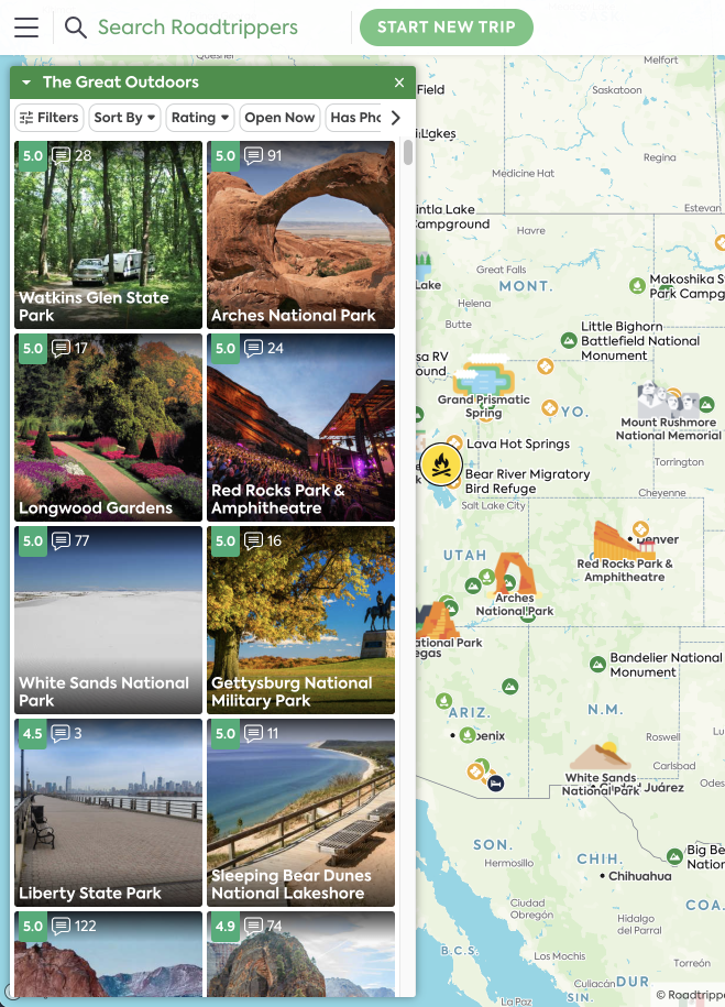
As it was, the desktop search results showed each POI result as a square card to highlight the location image.
Now, we wanted to conduct an experiment to see if including the "Add to Trip" CTA on these results would positively impact our metrics for the number of users who add a third waypoint to their trip, just as it did on mobile.
Teaming up with my small team of two product managers and another designer, we agreed to add a similar CTA to the desktop search results, mirroring our successful implementation on mobile. The aim was to quickly deploy and test the feature's impact, justifying further improvements.
After assessing the different results states, I proposed the quick solution of just adding the new button to the existing results, allowing us to quickly initate our tests and justify a full redesign.
However, upon discussing it with the team, we concluded that this approach wouldn't be the best path forward for users and would require more development time than anticipated.
Instead, after much deliberation, we decided I should create a quick mockup of a potential redesign to compare the levels of effort with developers.
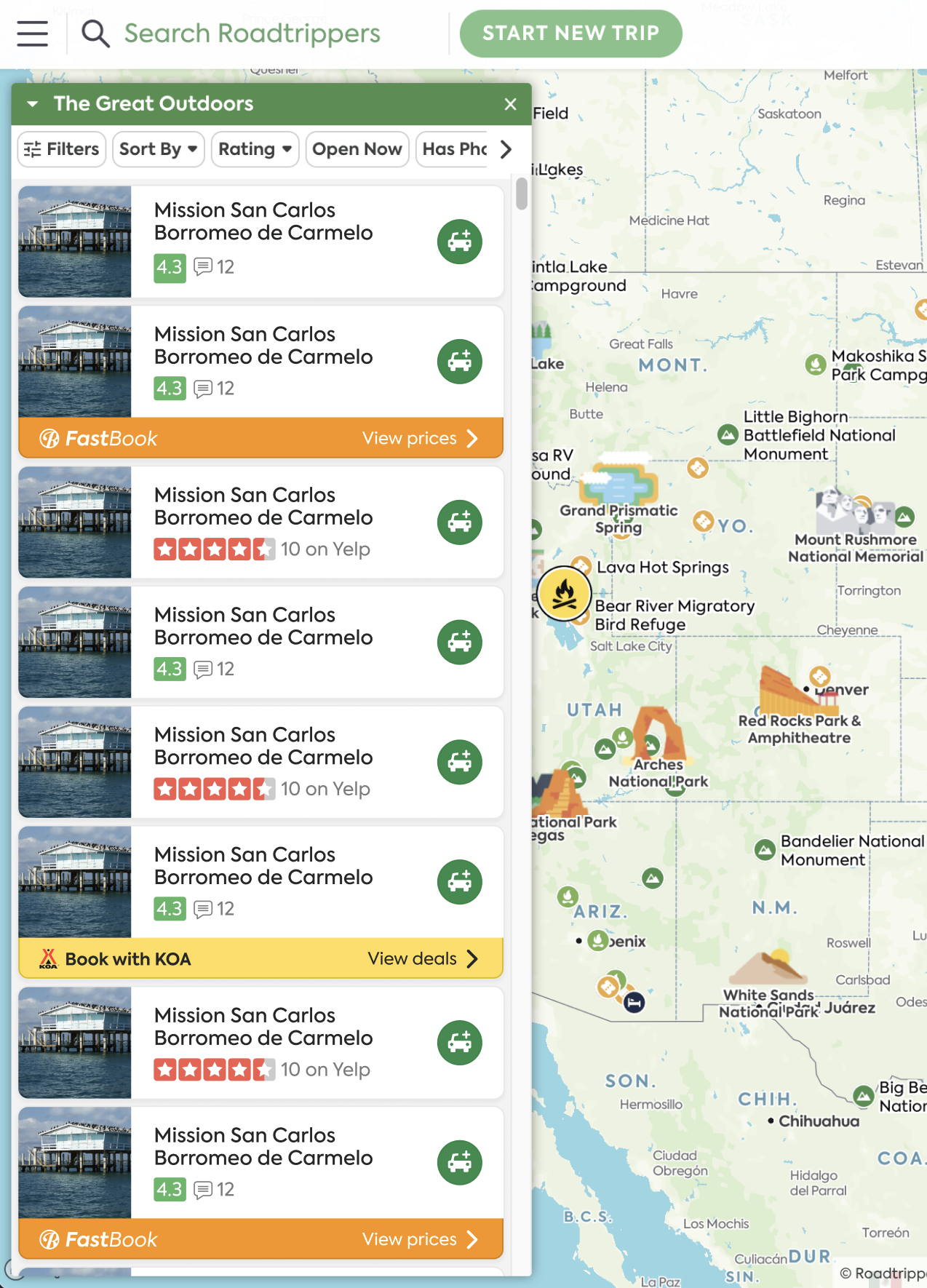
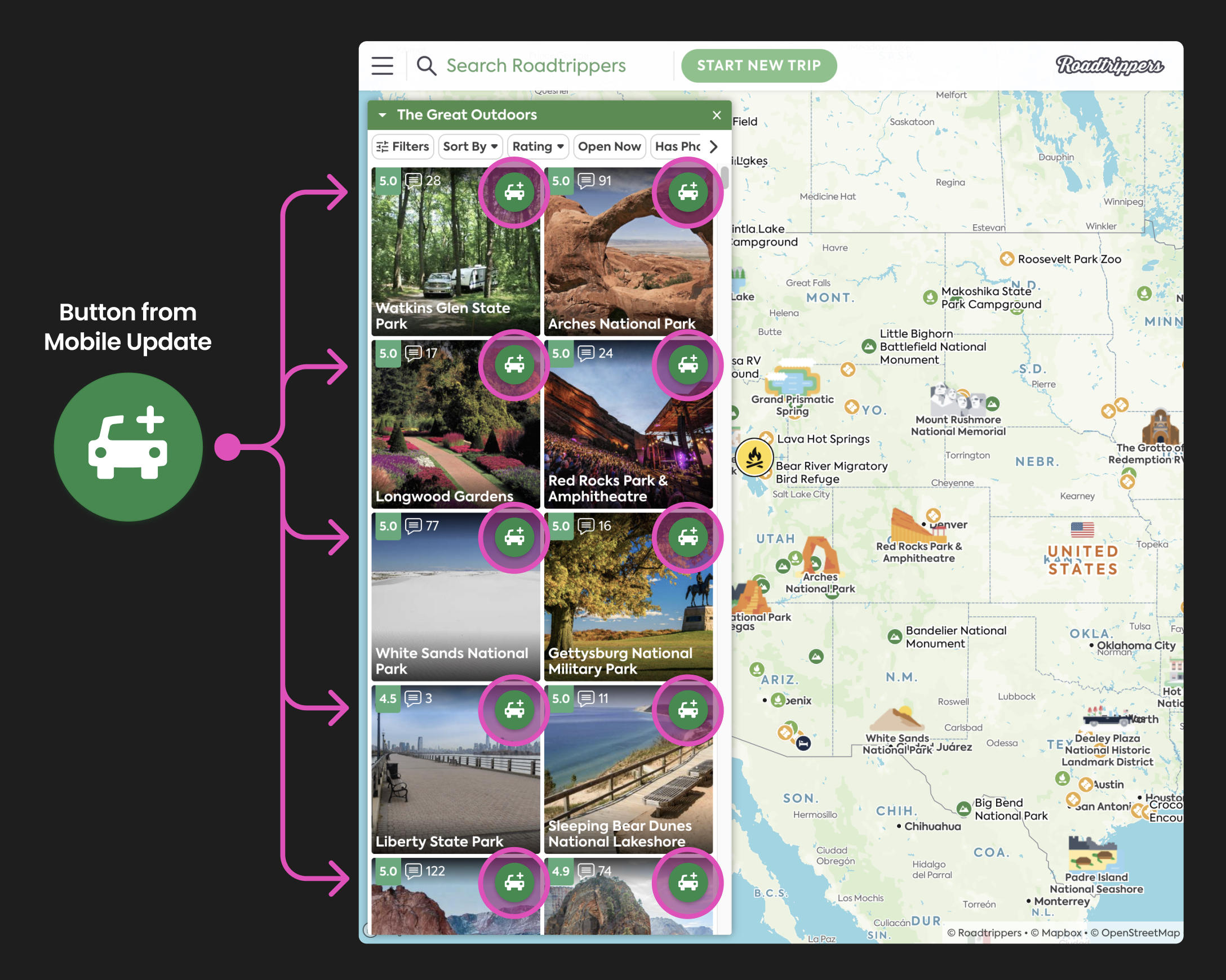
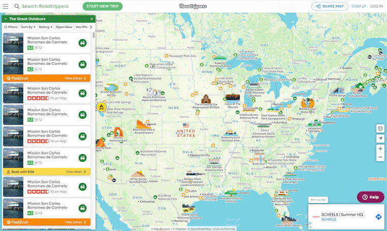
I explored a few different formats that incorporated the new button while retaining all existing information, ensuring that the update would only require CSS modifications.
While exploring the horizontal options, I remembered that the search results on mobile are also horizontal, so it would be pertinent to resuse the same pattern across platforms.
At this point I met with a developer to assess the effort required for two options: adding the button to the existing search results versus implementing a new design with the button as the only other update.
It turned out that both options required a similar level of effort, so I opted for the redesign because it would be a significantly better experience for the user.
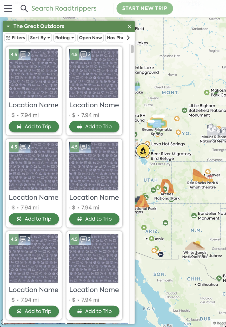
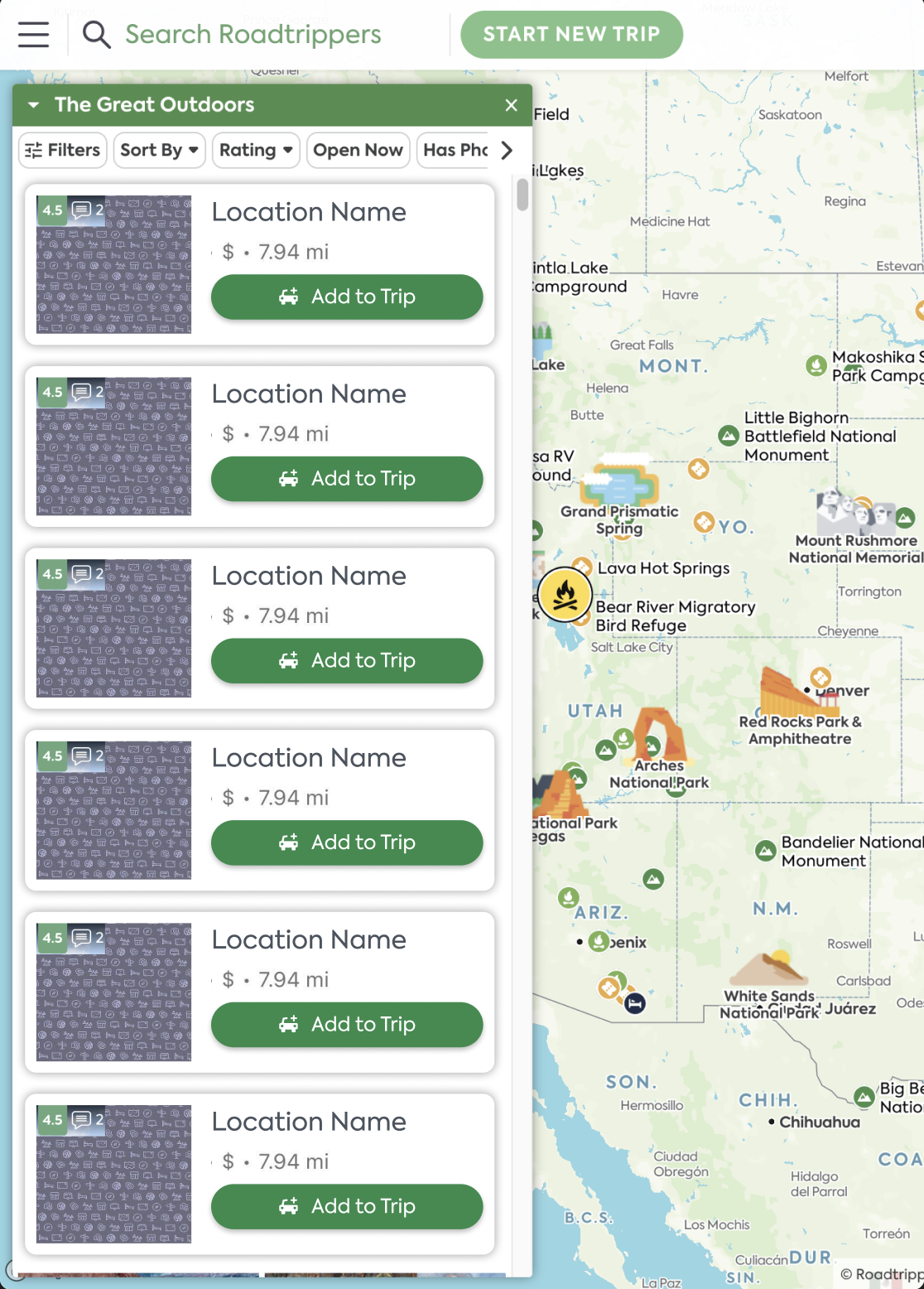
At this stage I created a Figma component for an individual search result card so that I could quickly make tweaks and visualize the impact in a mockup.
A challenge here was considering all four types of search results: regular, Yelp, Fastbook, and KOA. Additionally I would have to create hover states for each.
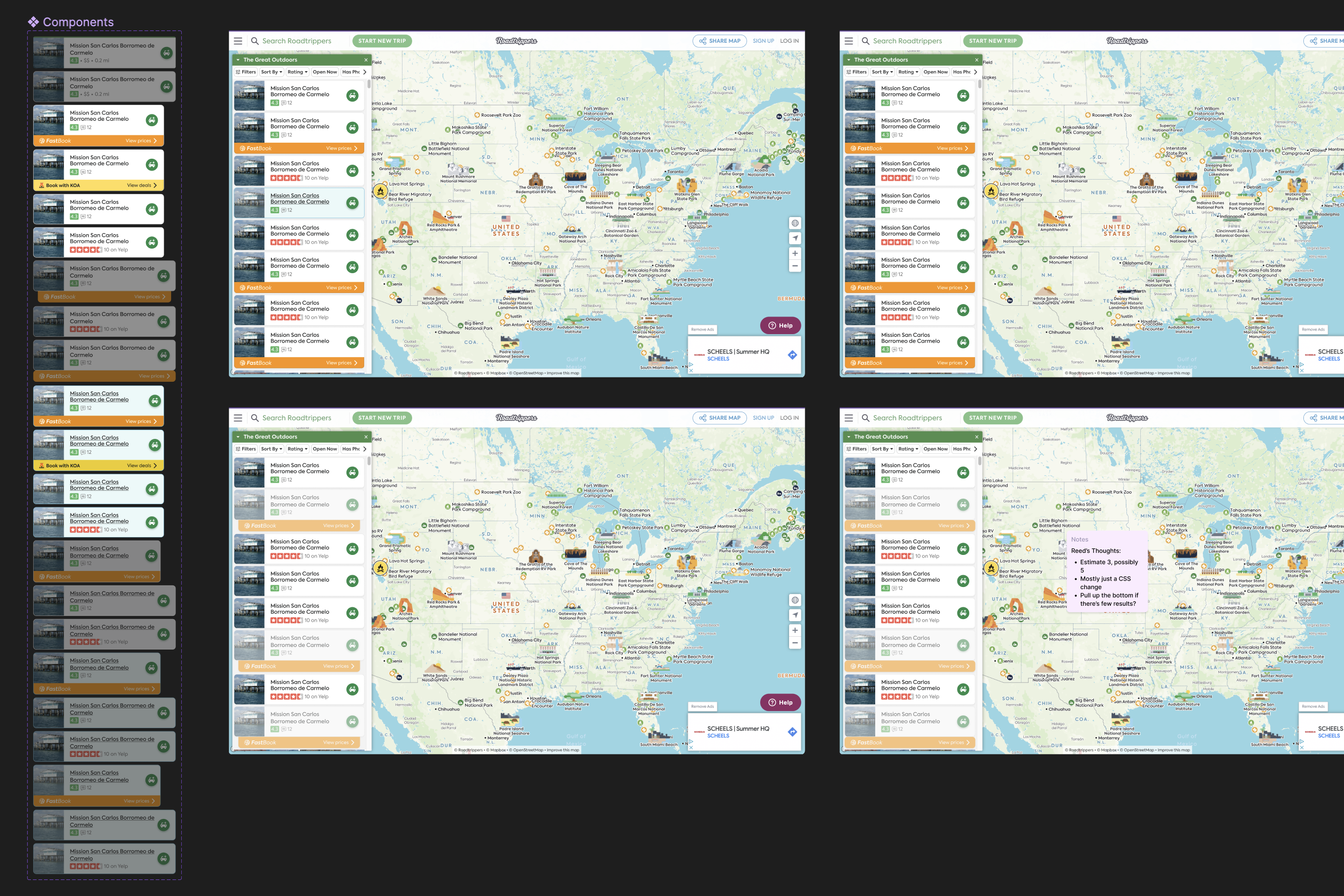
After experimenting with 9 different card configurations and 13 hover state options, I gathered feedback from my product managers and design team to settle on a clean design that embraced the mobile pattern while preserving to the desktop information.
The designs have been ticketed and are in the development backlog as of July 2023. The results for desktop are expected to be as successful as mobile. Data will be added once available.

