Enables firefighters to customize and communicate shifts
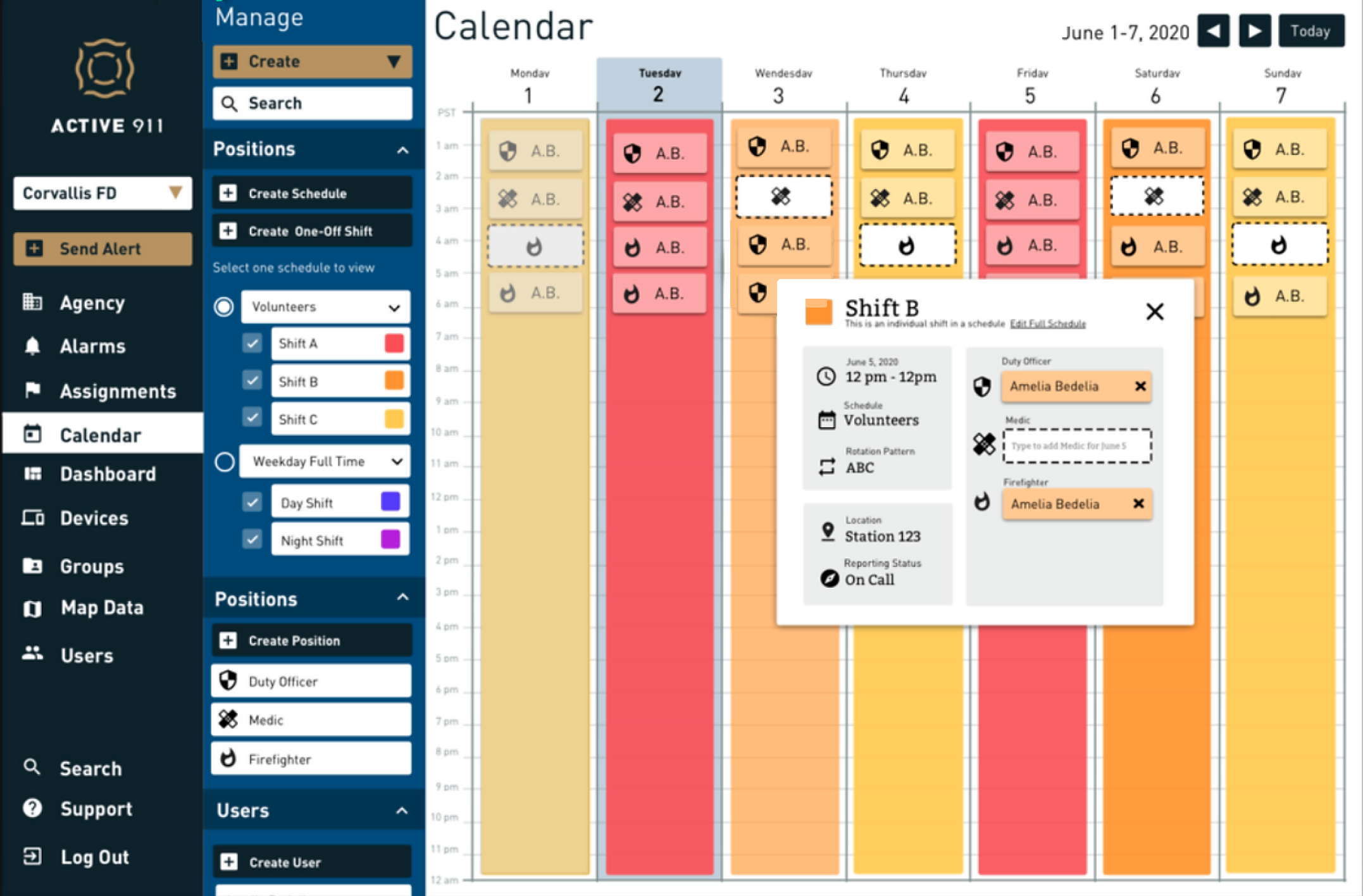
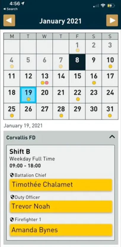
I created a desktop scheduling software for firefighters and an accompanying native mobile app
Active911 is a B2B2C software company whose flagship app helps emergency first responders get to the scene with the information they need.
As the company's first and only design hire, I was tasked to create their second paid product – a scheduling software to enable firefighters to create customizable shift rotations and manage personnel.
Role: Sole Product Designer
Skills Used: Market research, customer interviews, user flows, user testing, user research, wireframing, low and high fidelity mockups, interaction design, prototyping, cross-team collaboration
Tools used: Sketch, InVision, OneNote
Timeframe: ~2 months, 2020
We started with just the desktop app so that leadership customers would be able to set up their schedules within the existing desktop admin portal
Existing scheduling softwares do not accommodate the various shift rotations and specific needs of emergency first responders.
As part of the market, Active911 recognized this gap and tasked me to create a desktop scheduling product from scratch.
I began by conducting extensive interviews with 6 chiefs of staff, mostly in the fire industry, to figure out their current process: what's working, what's not working, and what's missing.
Next I trialled 4 scheduling softwares, and spoke to Active911 employees who had done previous research, to find the market fit. After all this research I had a solid understanding of the market and what people were looking for.
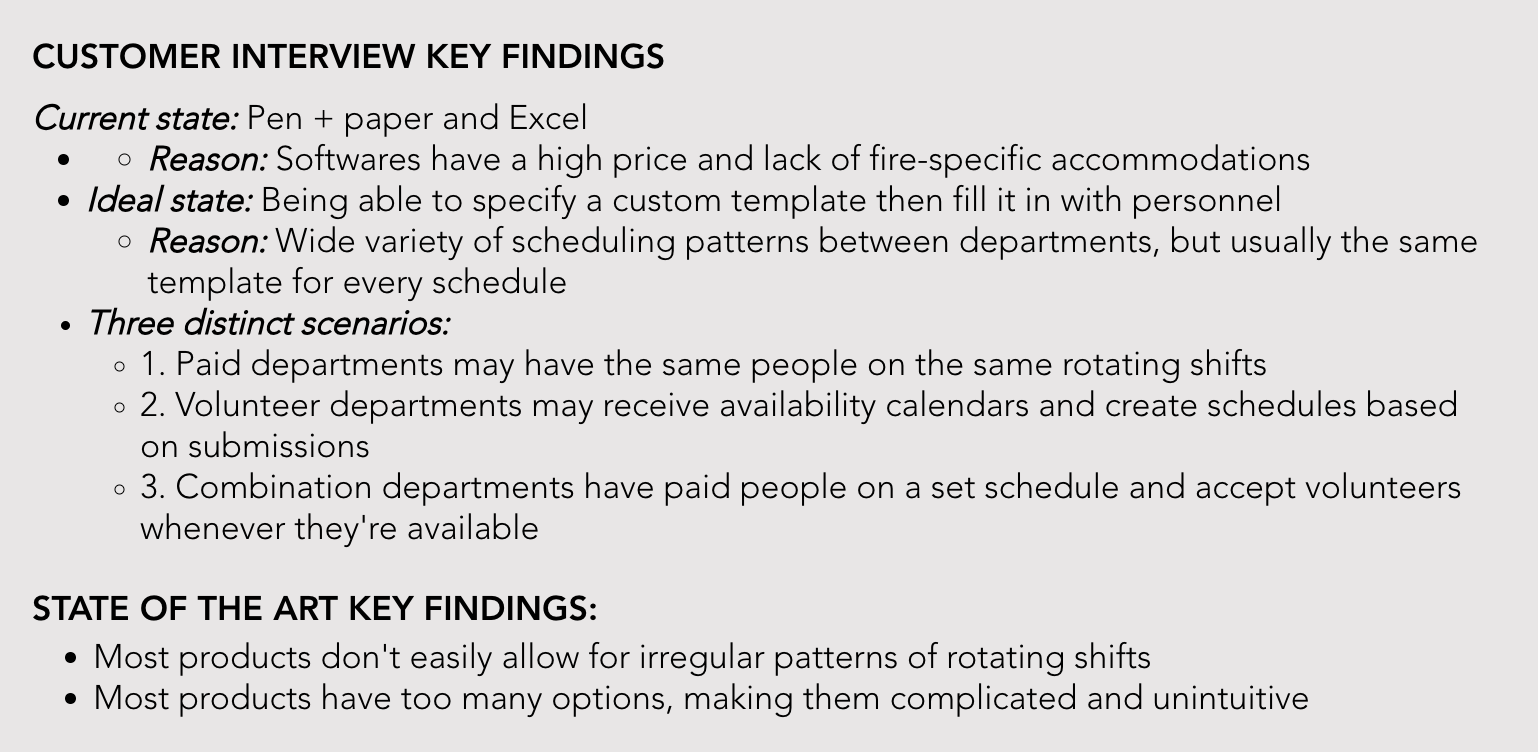
Collaborating with my product manager, we defined acceptance criteria by comparing our individual findings. We established an MVP and future product requirements using the 'Must, Should, Could' method.

Once we defined what the product needed to do, we dove into the main problems that needed to be solved:
"How might we arrange all the components in a logical and understandable way?"
"How might we provide a fully customizable shift rotation mechanism that is simple and intuitive?"
First, I solved the puzzle of how each element related to one another by experimenting with physical objects. Then, I used example scenearios from my initial research to work on the schedule creation, followed by the calendar view, navigation, and creating/editing/deleting components.
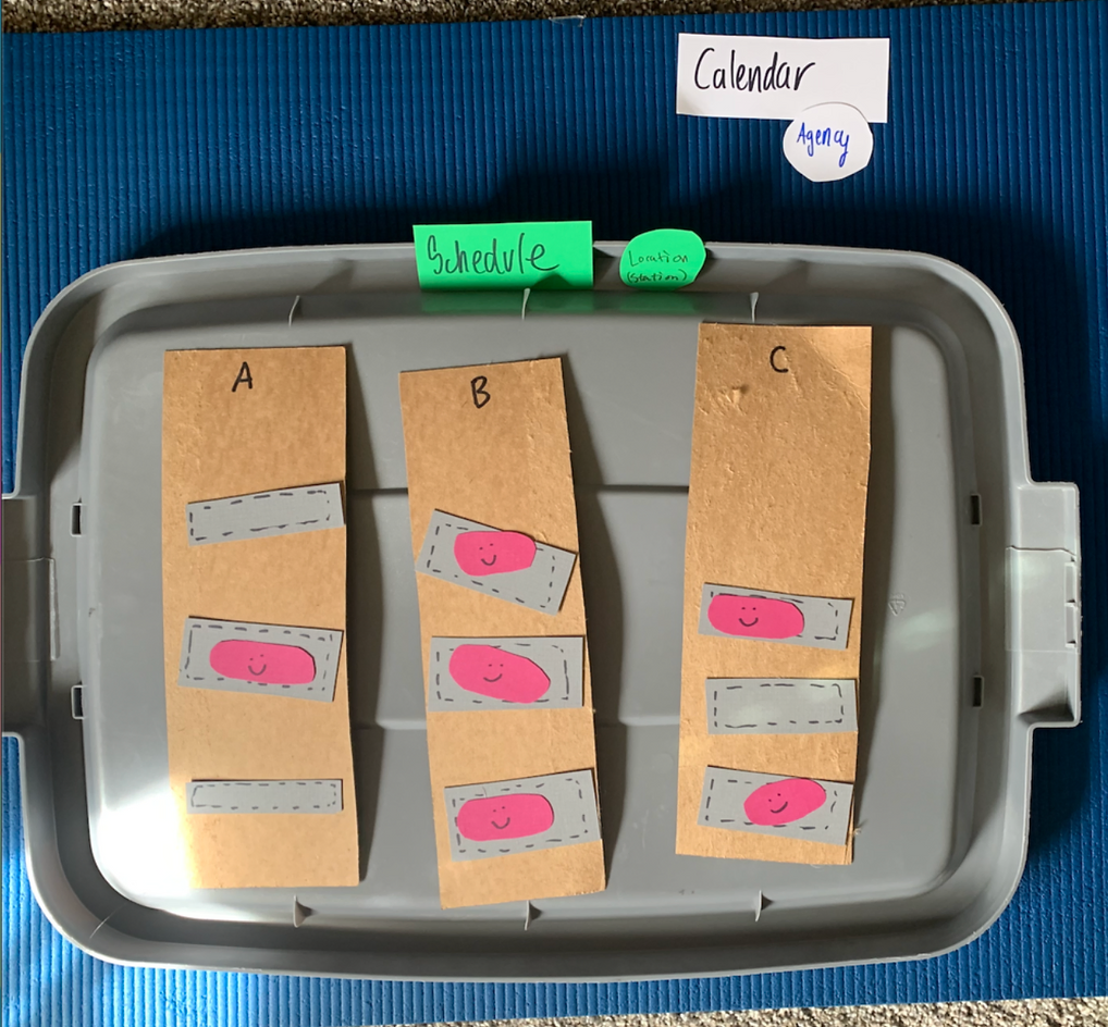
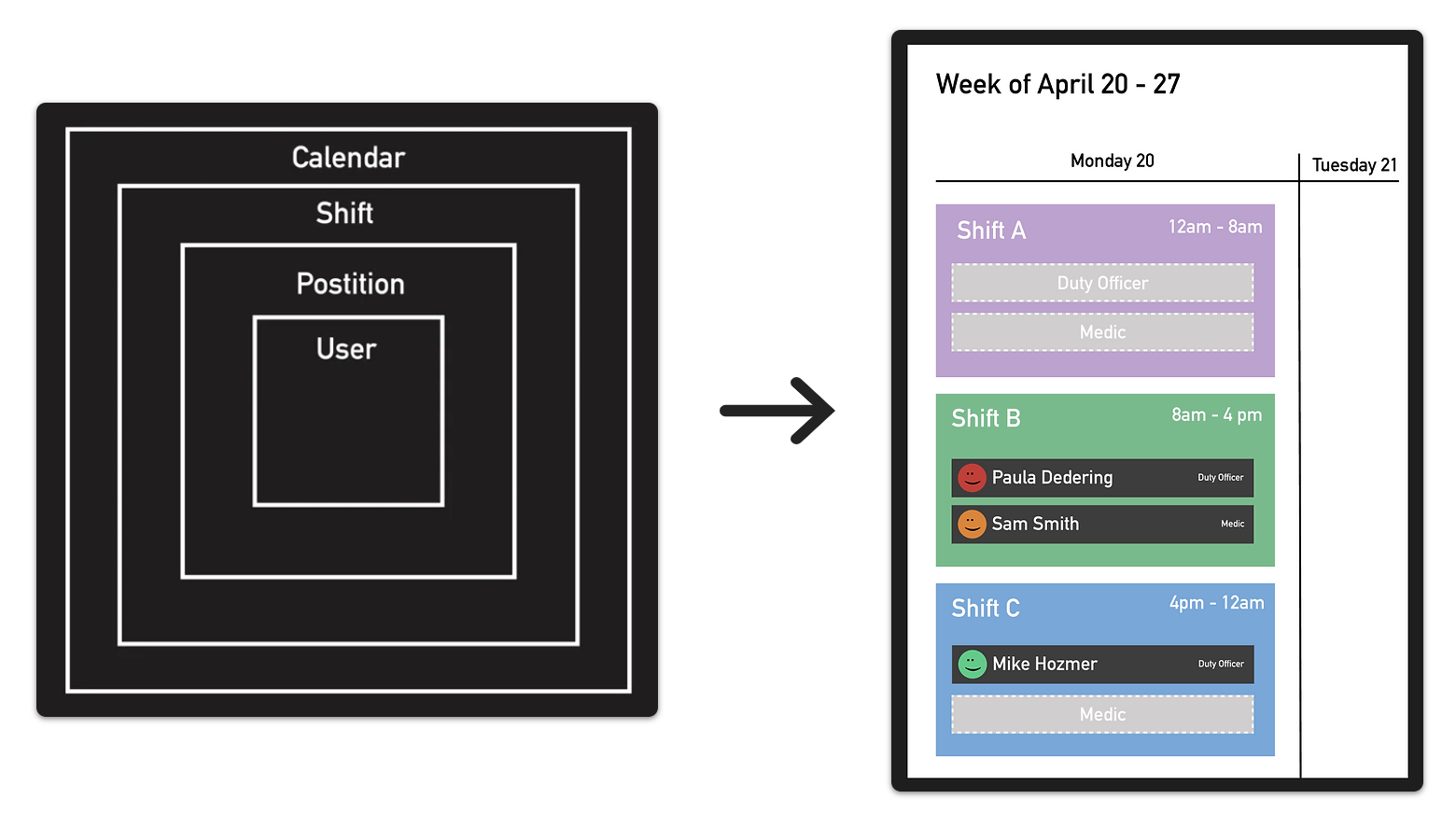

After the user flow was approved by the team I moved on to sketches and wireframes. During this stage I continutally checked in with stakeholders. I synced with my product manager almost daily, presented to the developers and QA engineers twice a week, and checked in with users at all the major breakthrough points.
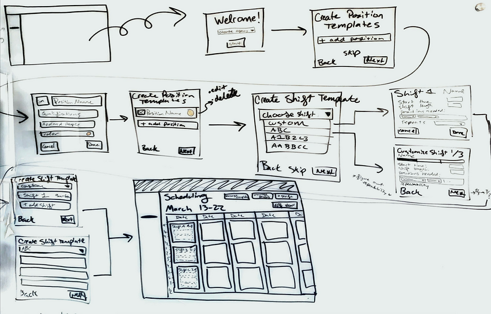
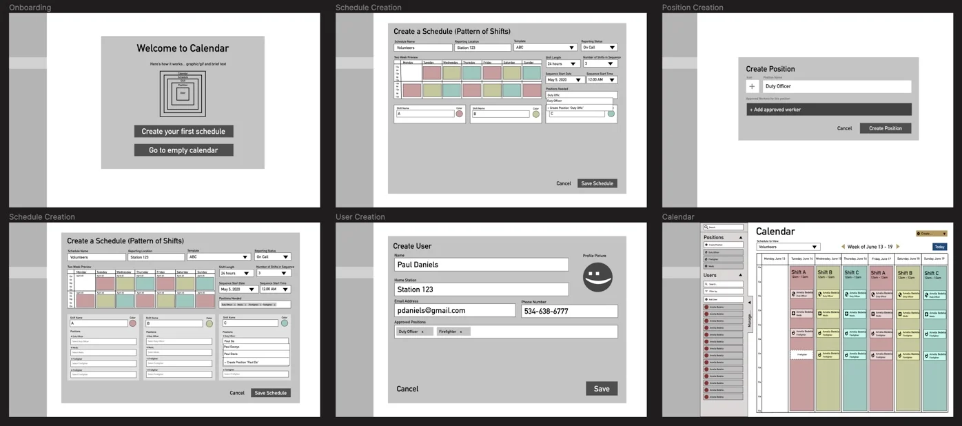
Once I refined the flow and wireframes, I created a functioning prototype in Sketch, with InVision and the Craft plugin, to user test with 4 of the same chiefs of staff.
Overall, it was well received, with some areas for improvement: the terms and flow made sense to everyone, but it soon became apparent that the mechanism for creating the schedule was incomplete. It left gaps in the schedule and it was not as customizable as they would have liked.
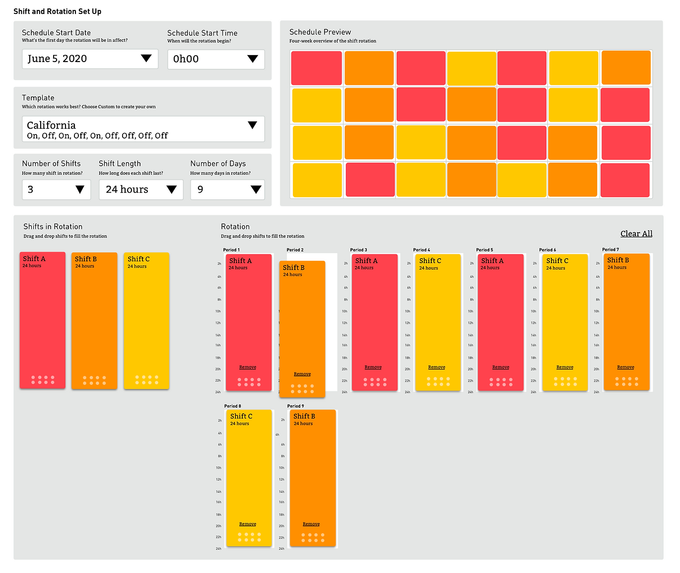
Once I understood what needed to changed, I got to work by experimenting with different UI elements and configurations until I eventually figured out a way to customize shifts that was intuitive, simple, and flexible.
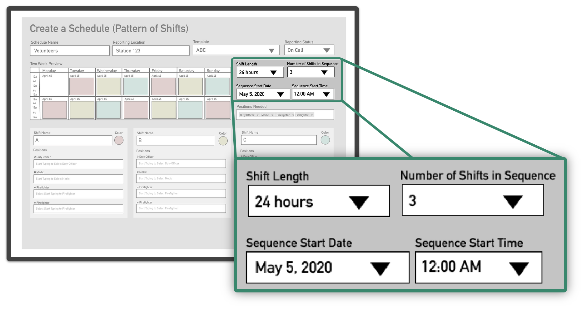

After dozens of iterations and extensive collaboration with the team, I finalized the MVP design. We opted for 24-hour shifts initially, with plans to add customizable times in a future update.
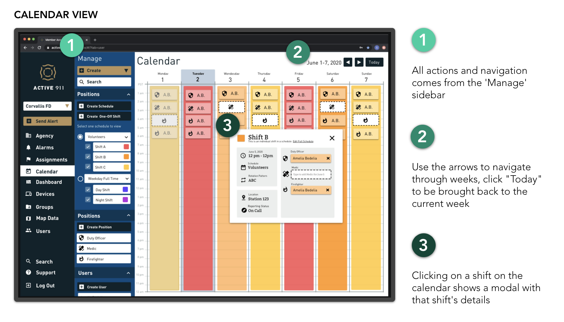
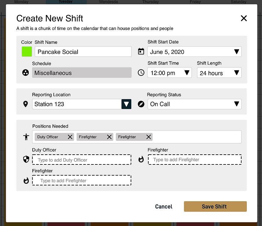
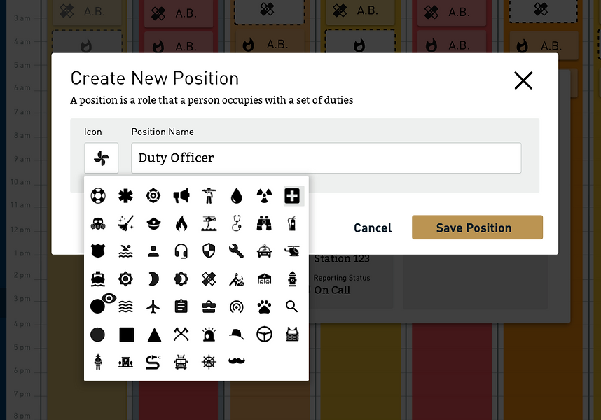
After roughly two months of work, I finished and passed off the final MVP documentation. The work included the rotating schedule creation, schedule editing, one-off shift creation, position creation, user creation, and a filtered view of the calendar.
The product was launched 3 months later to a Beta group of 100+ agencies as Active911's second product.
Overall the concept was well-received, but the adoption rate was lower than expected. Upon doing more interviews with beta testers, we found that the lack of features prevented agencies from being able to fully use the product.
Users were having a hard time:
After spending weeks of addressing these issues and fixing bugs, we still weren't seeing the adoption rate we expected, so we ramped up our interviews in an attempt to uncover the root issues.
We discovered that because users were accustomed to using the Active911 flagship app without an account, they expected the same behavior from this new scheduling software.
Once we validated the problem through more interviews and surveys, we decided we needed to build the app sooner than later with a clear and easy path to create an account.
We quickly identified the need for the mobile app because that's what most non-leadership customers used exclusively
After uncovering that users were experiencing enough friction by having a desktop-only product, we decided it was time to create the mobile version on native iOS and Android that users were looking for.

Once we defined what the product needed to do, we dove into the main problems that needed to be solved:
"How might we create a simple log in flow to accommodate all account statuses?"
"How might we provide a simple and beautiful way for users to access the information needed to get to the right place at the right time?"
Over the course of only 10 days I quickly put together an MVP of the mobile version of the scheduling app in order to get it into users hands so we could begin to iterate and make updates based on feedback. The feedback we'd recieve would dictate the roadmap for the entire product.
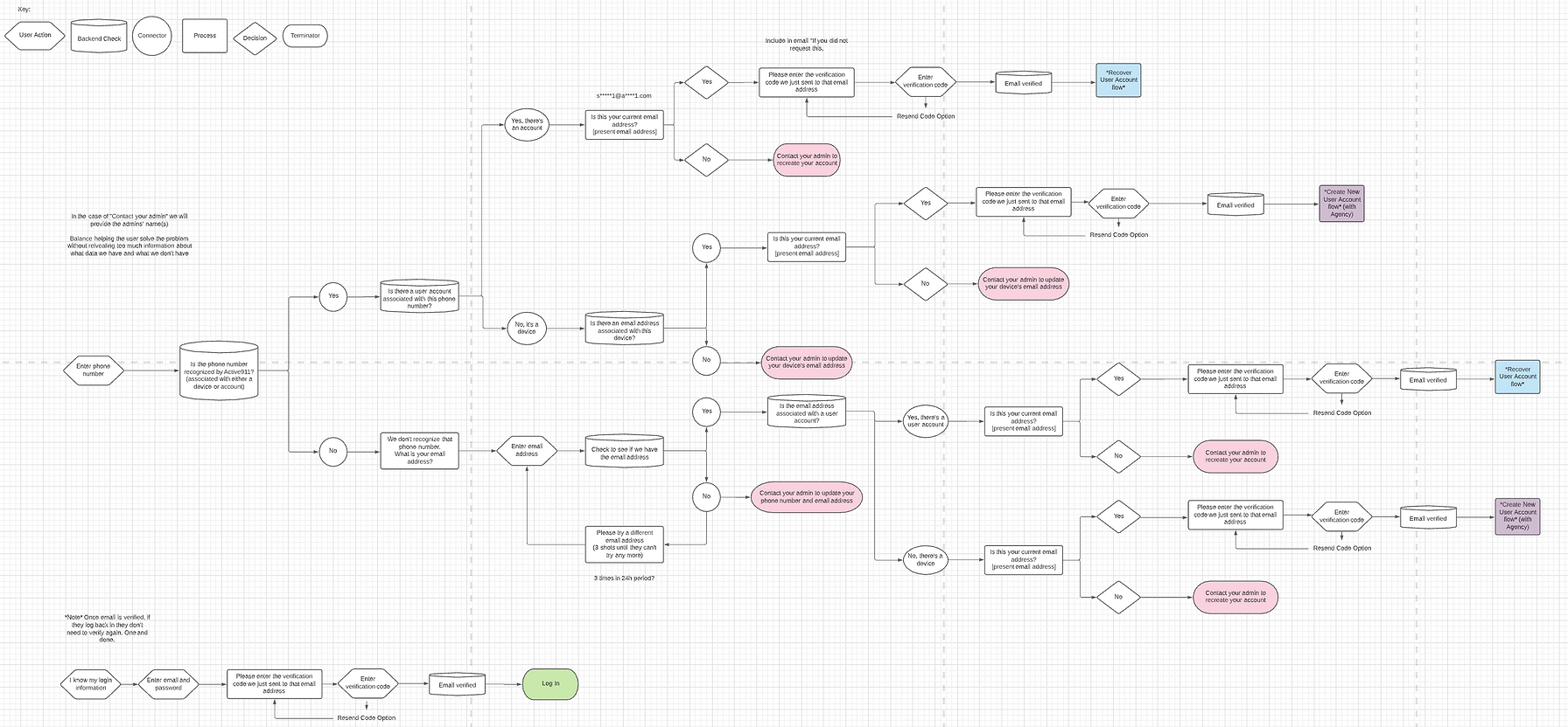
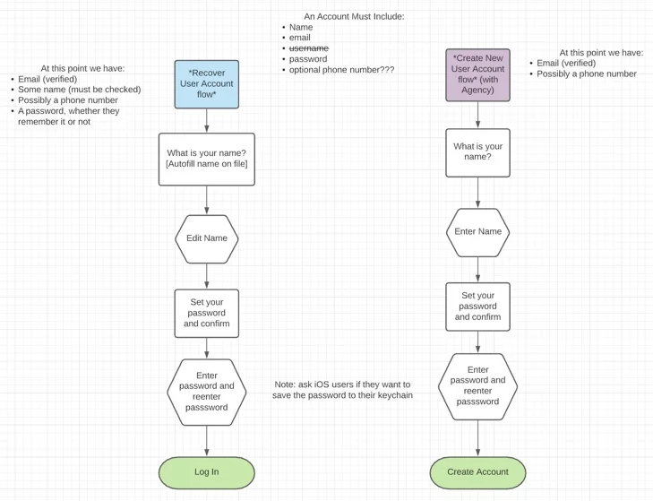
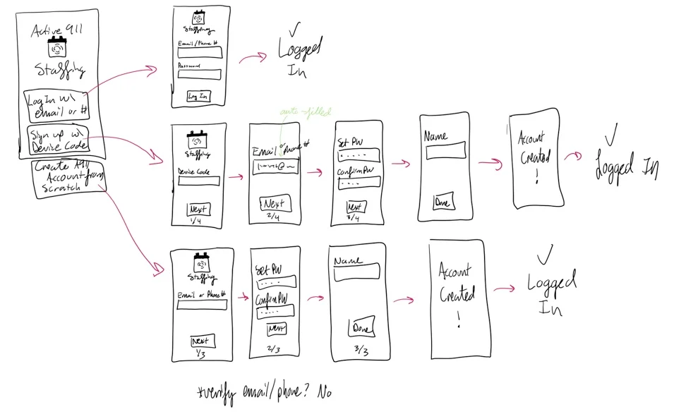

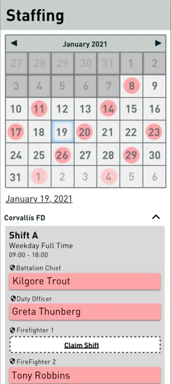
With such a quick turnaround, we knew the app would not be perfect immediately, but the goal was to get it in users' hands and gather feedback so that we could dive deeper into the root issues that were preventing adoption of the product.
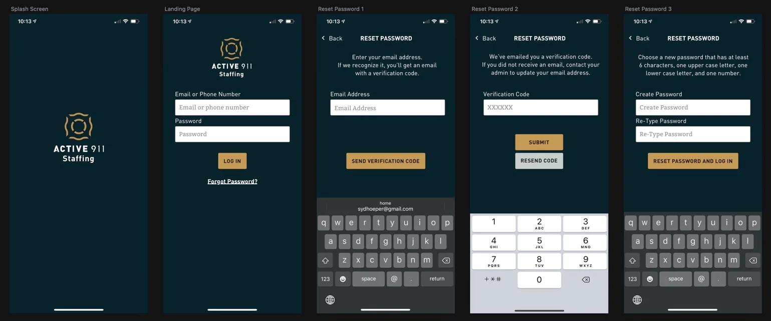

Customers were thrilled to have the mobile app, since that's what all of the personnel were accustomed to using. The account creation on mobile alleviated a lot of troubles with using the Active911 softwares as a whole. People continued to give a lot of feedback, so we continued to iterate to make the product continually better.
Since releasing the app and making continual iterations to the desktop version, the product was moved out of Beta and has been revenue-generating product for the company since 2021.
